16 popular font pairs for designers in 2026

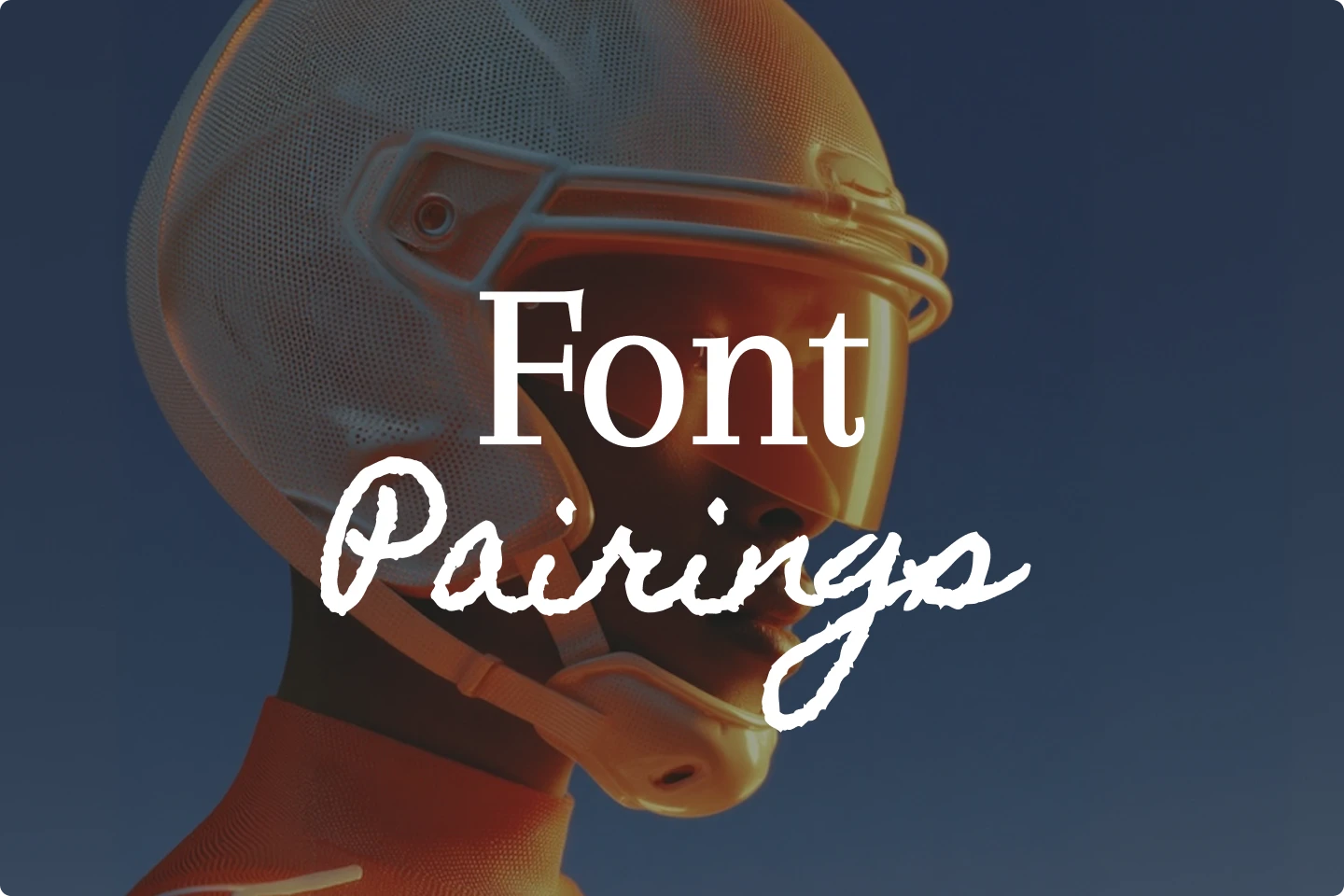
We made a complete list of the most popular font pairs that will be trending for creatives in 2026.
Fonts can make or break a design. The right type combination can bring balance, personality, and structure to your work, while the wrong one can make it look unpolished or confusing. That’s why designers spend so much time on font pairings.
In this list, you’ll find 10 popular font pairings that are versatile, readable, and stylish. Whether you’re working on a logo design, generating a poster, or building a brand identity, these examples will help you start pairing fonts with confidence.
TL;DR — 10 font pairs you’ll love
- Coiny & Caben Condensed
- Coustard & Fredericka the Great
- Margarine & Inspiration
- Jainy Purva & Instrument Serif
- Kristt & Im Fell DW Pica
- Kalinia & Jacquard 24
- Kulim Park & League Script
- Lancelot & La Belle Aurore
- Koulen & Kapakana
- Arapey & Homemade Apple
Why font pairings are important for designers
Font pairings help guide the reader’s attention, build structure, and create a sense of flow from one element to another. Good font choices make information easier to scan and understand, especially when headlines and body text work together.
For designers, thoughtful font pairs also shape how a project feels. The right combination can instantly make something appear modern, classic, playful, or refined. These choices influence tone and mood long before anyone reads the words themselves.
In the end, pairing fonts well gives your work clarity and cohesion. It helps your message stand out and makes every piece of text feel intentional and well designed.
1. Coiny & Caben Condensed
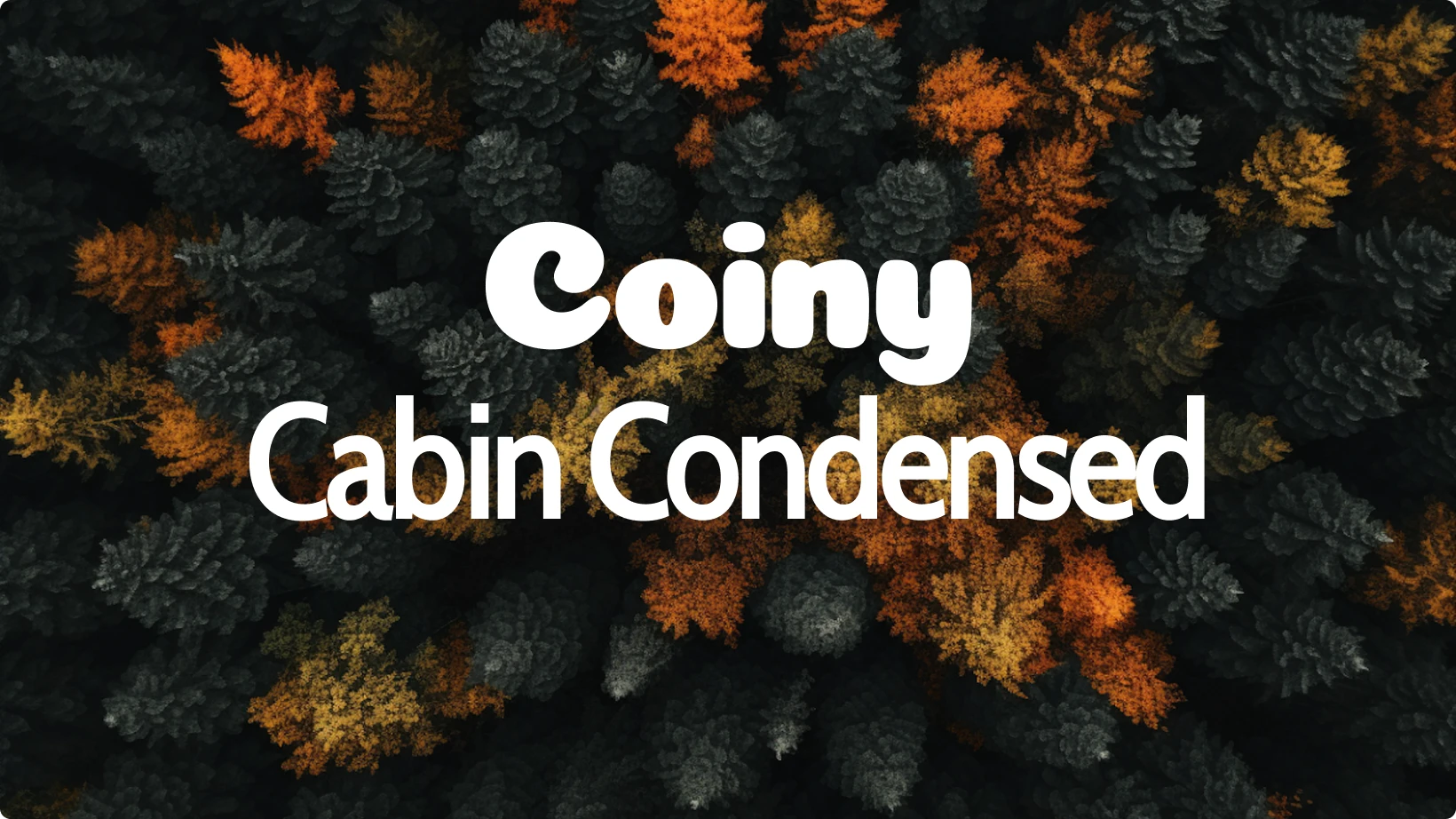
Coiny’s rounded, friendly style works perfectly with Caben Condensed’s narrow letterforms. This pairing has a balanced mix of playfulness and professionalism, making it great for social media tools, posters, or startup branding.
Coiny is bold and bubbly, which helps it shine as a header or logo font. Caben Condensed, on the other hand, keeps things tidy in body text, thanks to its slim proportions. Together, these font pairs bring character without sacrificing clarity.
Best for: fun brand identities, social ads, and bold web design.
2. Coustard & Fredericka the Great
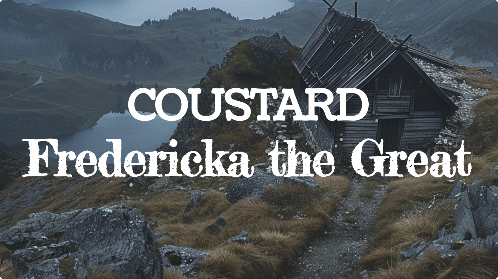
Coustard is a dependable slab serif with a clean and modern tone. Fredericka the Great adds a hand-drawn twist that feels quirky yet sophisticated.
Designers often use this font pairing to create contrast between structure and creativity. Coustard provides legibility and balance, while Fredericka the Great adds personality through its uneven strokes.
If you’re working on an editorial design, this pair creates a handcrafted look without losing polish.
Best for: magazine layouts, creative portfolios, and artistic posters.
3. Margarine & Inspiration
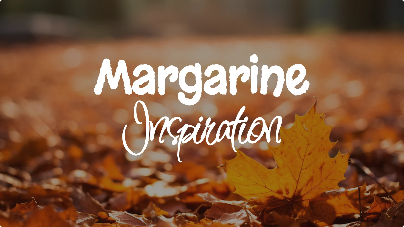
Margarine is cheerful and expressive, while Inspiration is elegant and fluid. Together, these fonts strike a great balance between fun and refinement.
This is a go-to combination for brands that want to feel approachable but also stylish. Margarine can serve as your header font, setting a friendly tone, while Inspiration’s cursive flow is perfect for accents or callouts.
Best for: packaging design, invitations, and lifestyle branding.
4. Jainy Purva & Instrument Serif
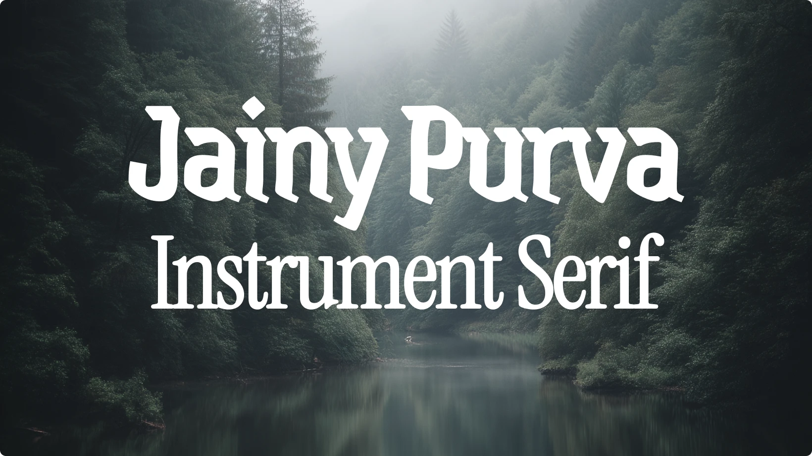
Jainy Purva brings a modern sans serif energy that contrasts beautifully with the more traditional Instrument Serif. The result is a blend of contemporary and classic appeal.
This font pairing works particularly well for tech and creative industries that want to look innovative yet grounded. Jainy Purva offers crisp geometry for headers, while Instrument Serif’s slight humanist tone makes body copy feel approachable.
You’ll often see combinations like this in blog headers, web interfaces, and product branding.
Best for: digital branding, blog design, and tech startups.
5. Kristt & Im Fell DW Pica
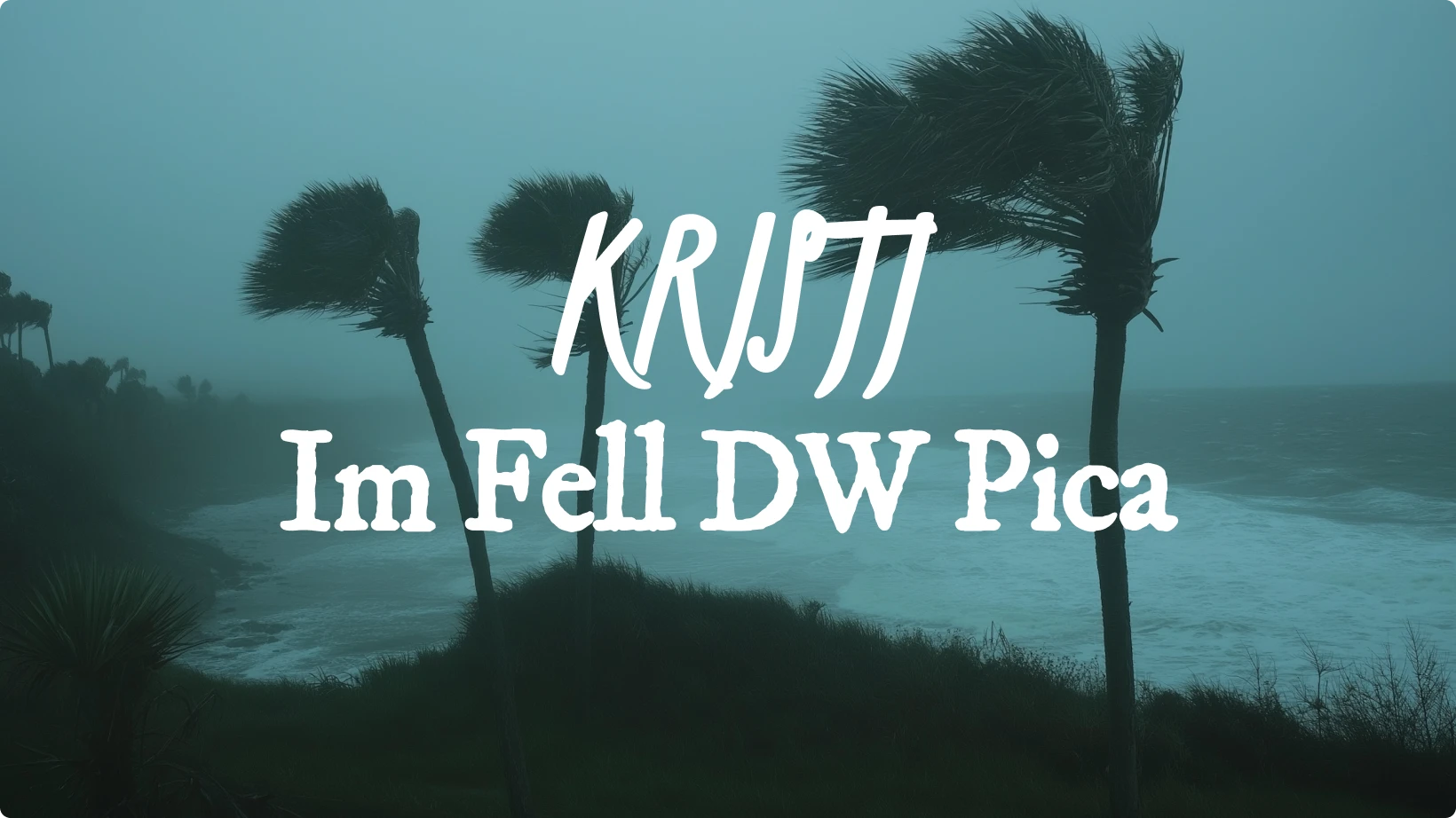
Kristt’s clean design feels modern and minimal, while Im Fell DW Pica carries historical charm. Together, they form a high-contrast duo that feels intellectual yet accessible.
Designers love this combination because it merges old-world style with a modern sensibility. Kristt keeps layouts simple, while Im Fell DW Pica adds just enough flair to stand out in titles or quotes.
When you want your design to look academic but not dated, this is one of the best font pairings to try.
Best for: book covers, editorial layouts, and elegant presentations.
6. Kalinia & Jacquard 24
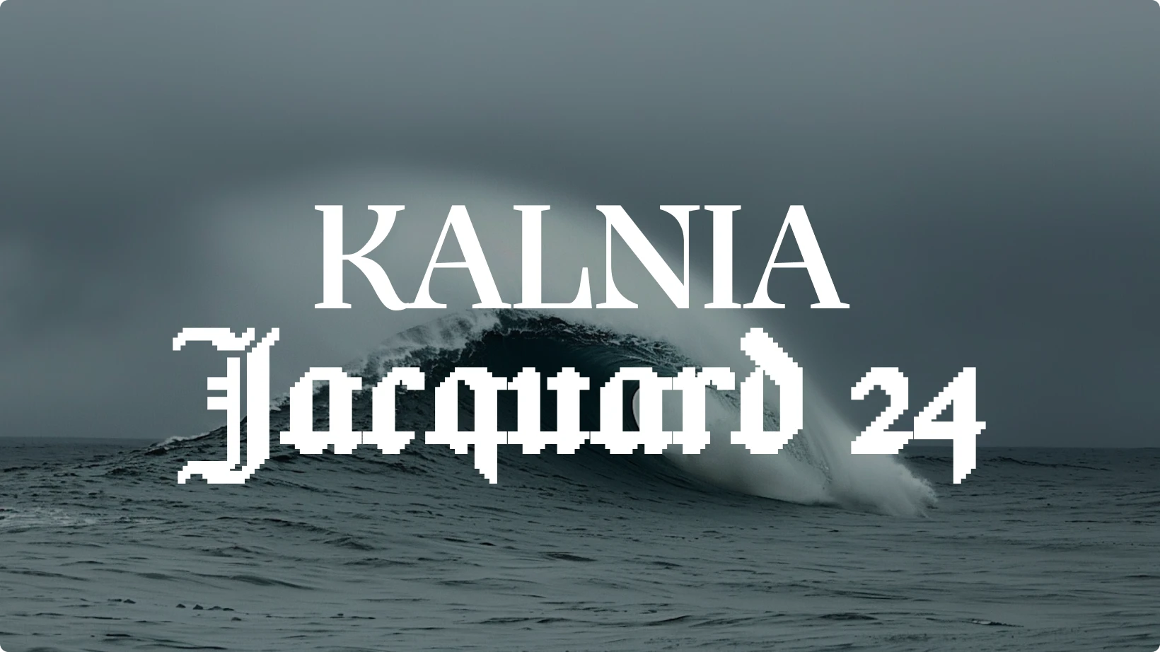
Kalinia’s geometric forms meet Jacquard 24’s artistic textures in this striking combination. The result is visually rich, making it perfect for high-impact designs that need personality.
Because Jacquard 24 is quite expressive, it works best in headlines or accent text. Kalinia, being more structured, keeps everything cohesive and readable.
If you’re experimenting with pairing fonts for posters or brand visuals, this duo offers the right amount of drama without overwhelming the page.
Best for: posters, fashion branding, and album covers.
7. Kulim Park & League Script
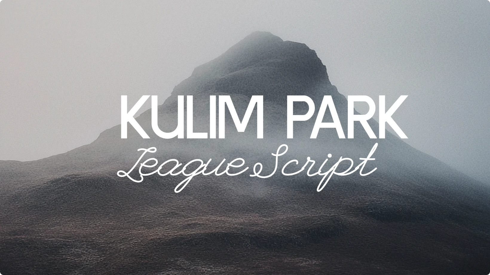
Kulim Park is modern, versatile, and clean, while League Script brings a personal, handwritten feel. The two make a strong pair for designs that mix professionalism with warmth.
Kulim Park can handle long blocks of text with ease, while League Script shines in subheadings, quotes, or accents. The visual contrast between them keeps the design engaging and readable.
This font pairing is great for digital storytelling or brand materials that want a mix of clarity and emotion.
Best for: blogs, lifestyle brands, and small business websites.
8. Lancelot & La Belle Aurore
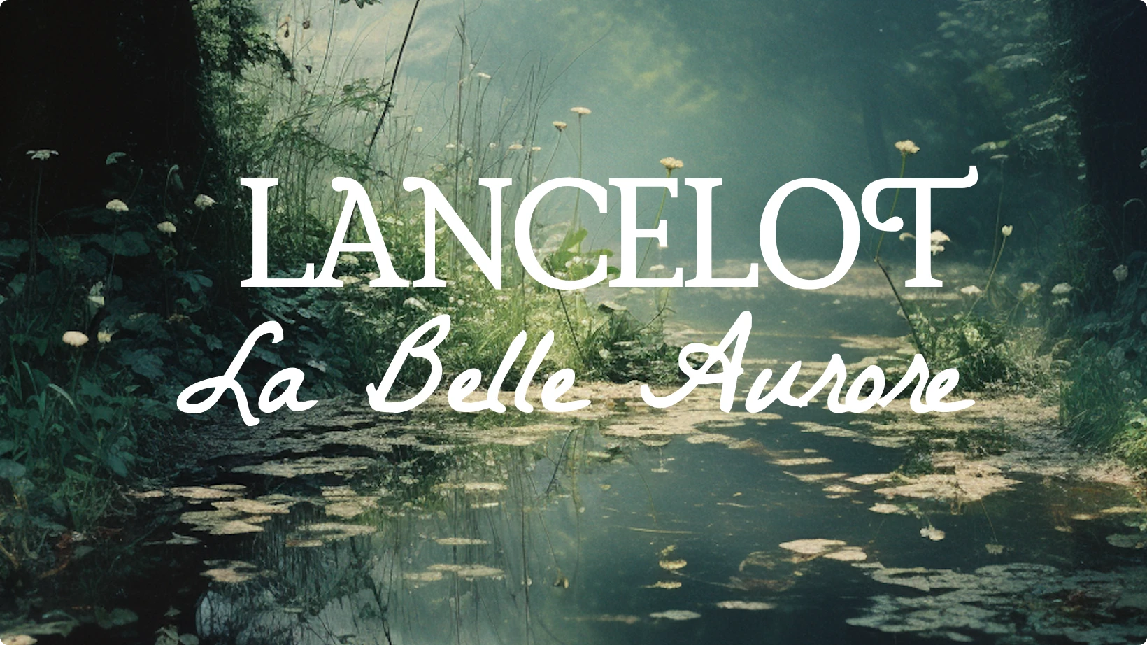
Lancelot’s elegant serifs combine beautifully with La Belle Aurore’s delicate script. This is a timeless font pair that feels refined without being overly formal.
Designers often use this combination for wedding invitations, portfolios, and branding projects that call for sophistication. Lancelot handles readability, while La Belle Aurore adds graceful detail.
If you need to bring a touch of luxury to your design without clutter, this pairing does it effortlessly.
Best for: invitations, luxury branding, and creative portfolios.
9. Koulen & Kapakana
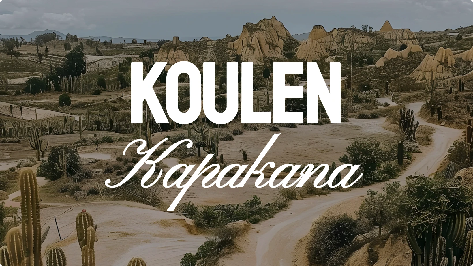
Koulen is bold, blocky, and confident. Kapakana, on the other hand, adds flow and elegance with its handwritten curves.
This pairing is bold yet balanced, making it ideal for creative projects that want a strong personality. Koulen dominates as a display font, while Kapakana softens the tone.
If you like combining expressive fonts but still want readability, this font pairing hits the sweet spot.
Best for: event posters, restaurant menus, and expressive brand logos.
10. Arapey & Homemade Apple
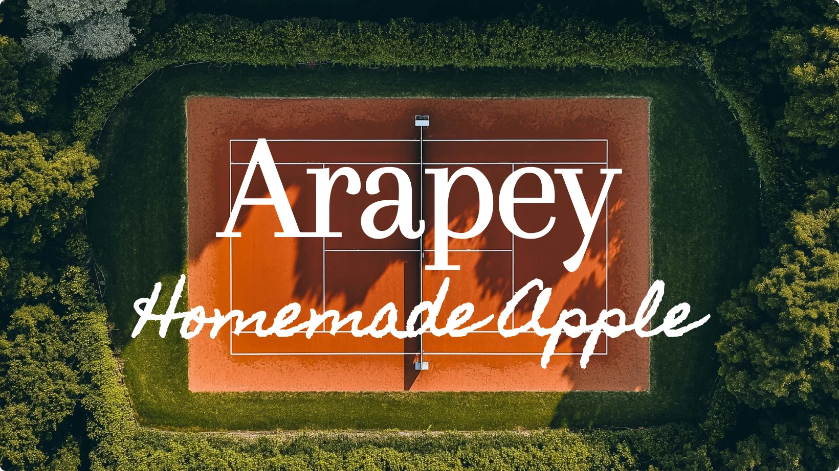
Arapey offers classic serif charm with beautiful contrast between strokes. Homemade Apple, a casual script, complements it with an approachable and organic vibe.
When used together, they create an inviting design that feels natural and sophisticated. Arapey gives structure to your headers and paragraphs, while Homemade Apple adds personality to callouts or brand marks.
This font pair works well for lifestyle and wellness brands where warmth and trust are key elements.
Best for: lifestyle branding, editorial projects, and product packaging.
11. Borel & Bodoni Moda

Borel has a playful, handcrafted look that brings warmth and friendliness to a design. Bodoni Moda, in contrast, is sleek and refined, with sharp serifs and strong vertical stress. When combined, they create a visual balance between fun and sophistication.
Borel can grab attention as a header or accent font, while Bodoni Moda keeps paragraphs elegant and structured. This font pairing works especially well when you want your design to feel creative yet classy.
Best for: lifestyle blogs, boutique branding, and packaging design.
12. Agbalumo & Amatic SC
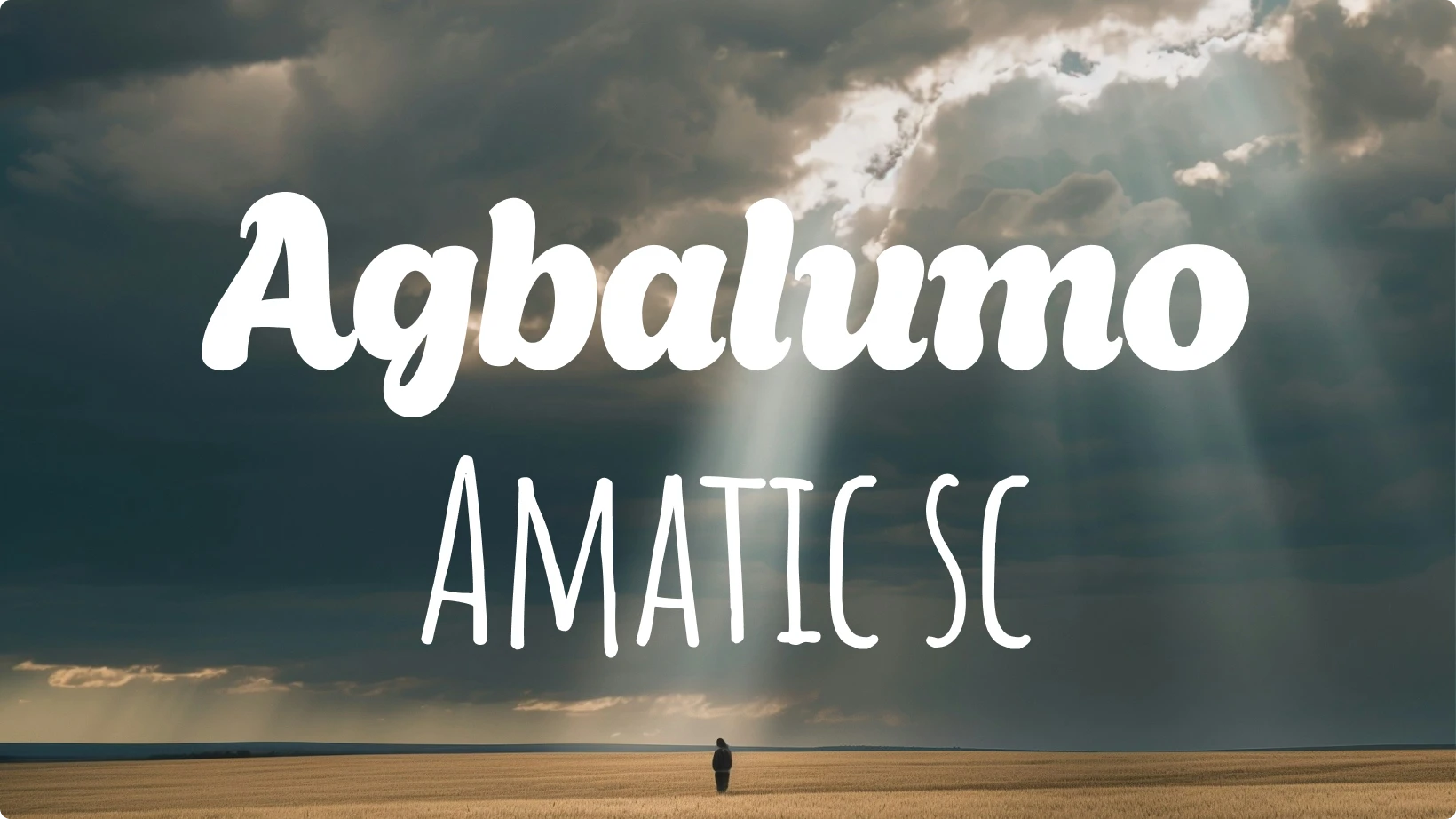
Agbalumo’s thick, expressive letterforms make a strong statement, while Amatic SC’s tall and narrow design adds a handwritten touch. Together, they create one of those font pairs that feels bold but still approachable.
This combination shines in projects that need personality and visual contrast. Agbalumo handles the heavy lifting in titles, while Amatic SC provides texture and uniqueness in subheads or quotes.
If you’re pairing fonts for a creative or artsy project, this duo will make your content stand out with style.
Best for: posters, event branding, and playful web headers.
13. Beth Ellen & Baskerville
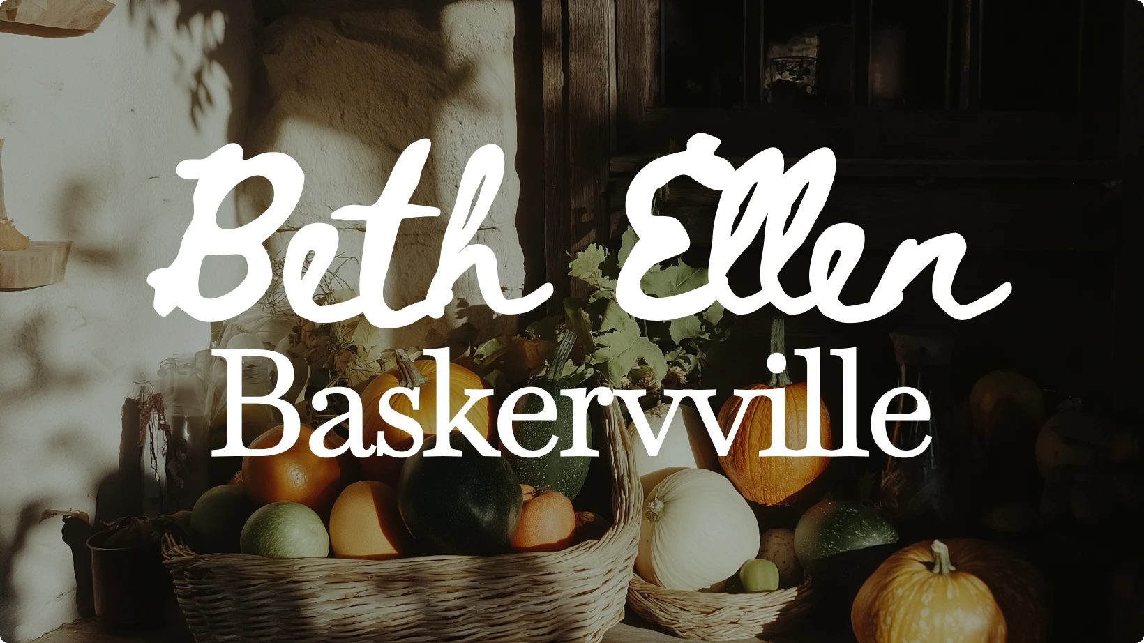
Beth Ellen is casual and expressive, with the look of hand-drawn ink. Baskerville, on the other hand, is a timeless serif known for its readability and elegance.
Together, they create a design that feels personal yet professional. The loose rhythm of Beth Ellen contrasts beautifully with Baskerville’s precision. Use Beth Ellen for titles or pull quotes, and keep Baskerville for long-form text.
This font pairing adds warmth and trustworthiness to any creative project.
Best for: portfolios, newsletters, and storytelling-focused brands.
14. Briem Hand & Cedarville Cursive
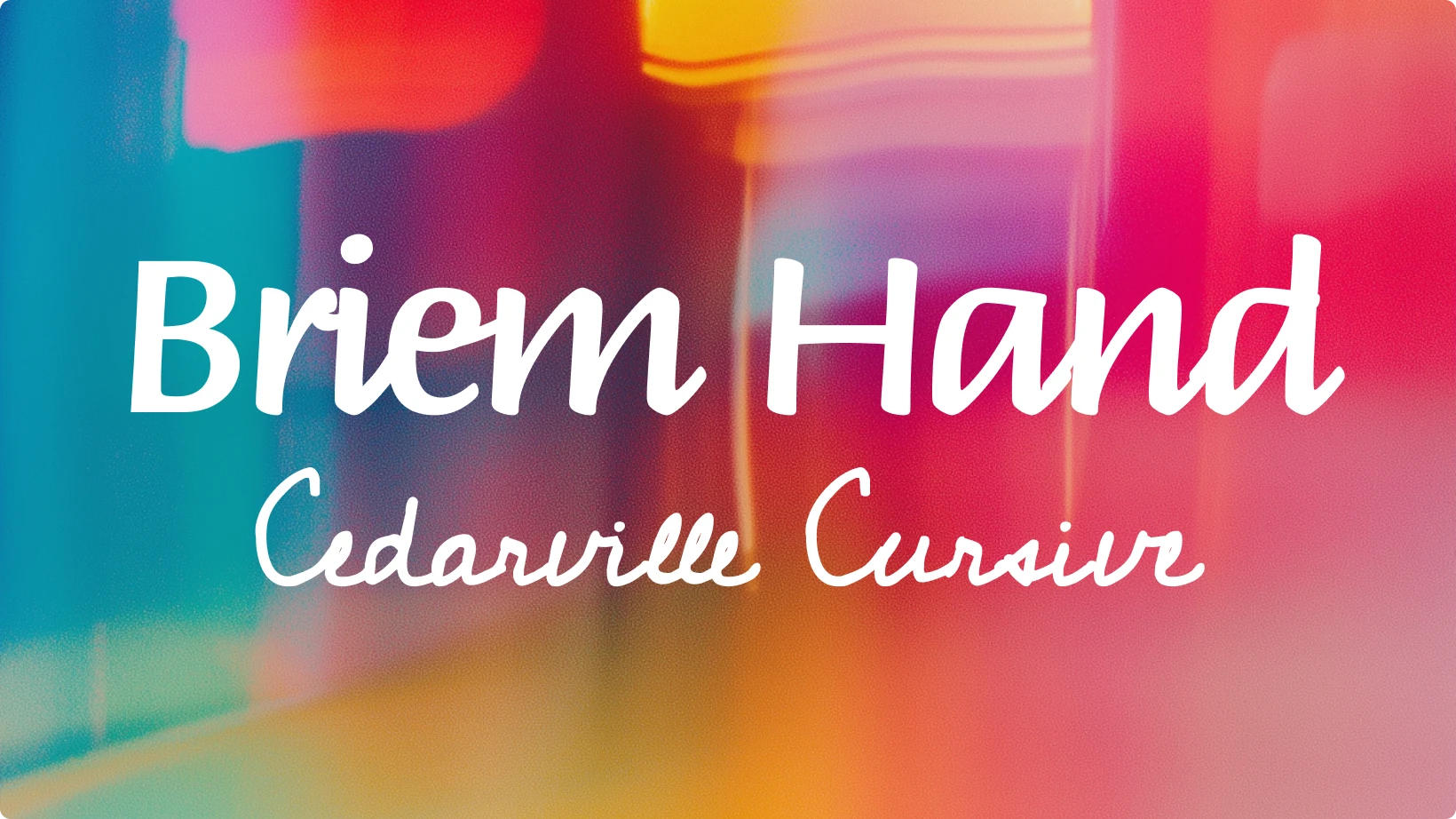
Briem Hand is confident and readable, with strokes that feel both human and balanced. Cedarville Cursive adds softness and flair with a flowing handwritten style.
When combined, the result is expressive but still polished. Briem Hand keeps things structured, while Cedarville Cursive brings in a more emotional, organic tone.
Designers love this font pair for its authenticity — it feels crafted without being chaotic.
Best for: invitations, handmade product branding, and creative marketing visuals.
15. Abhaya & Aquafina Script
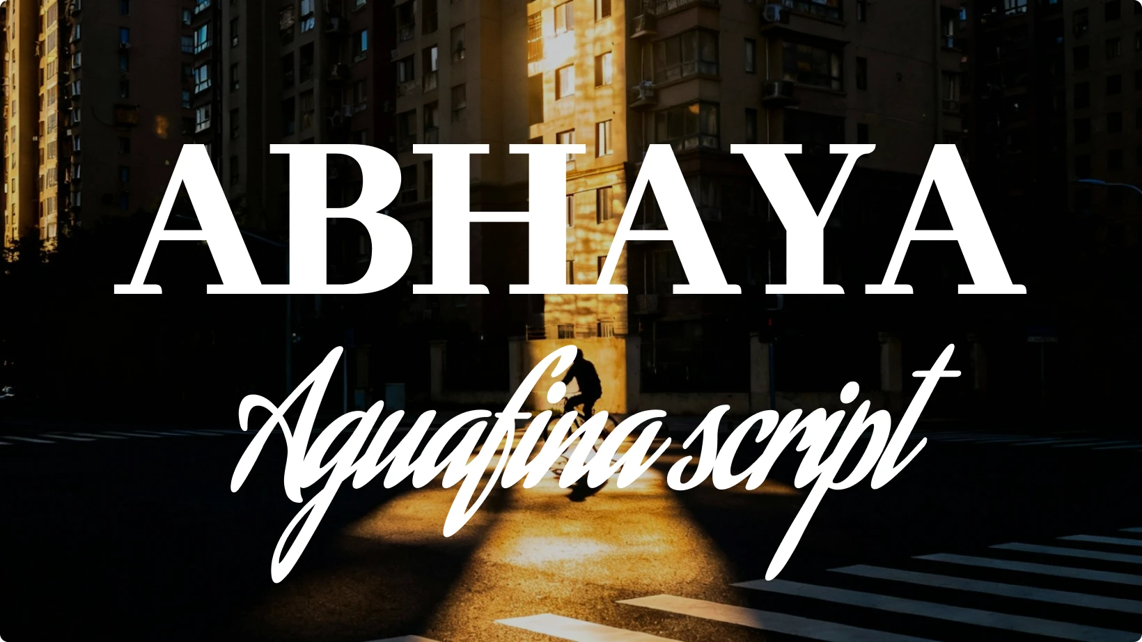
Abhaya is a modern serif rooted in traditional design. It offers stability and high readability, making it a strong choice for main text. Aquafina Script, on the other hand, introduces elegance with its fluid, decorative strokes.
The two together deliver a high-end aesthetic that feels both graceful and grounded. Abhaya establishes credibility, while Aquafina Script adds a soft personal touch.
If you’re pairing fonts for premium design projects, this one communicates sophistication and trust.
Best for: luxury brands, editorial design, and formal invitations.
16. Bungee & Bricolage Grotesque
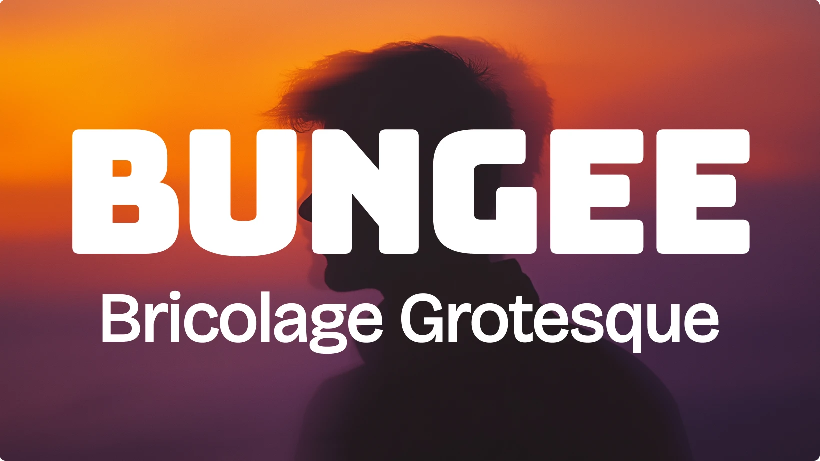
Bungee’s bold, display-ready personality grabs attention instantly. Bricolage Grotesque, a versatile sans serif, balances it out with clarity and structure.
This font pairing is energetic and modern, great for designers who want to make a bold statement without losing professionalism. Use Bungee for hero headlines and Bricolage Grotesque for supporting text to keep your layout balanced.
If you’re looking for contrast that feels intentional and dynamic, this is a combination that delivers.
Best for: branding, digital ads, and attention-grabbing visuals.
Make your designs pop with these font pairs
Good design often starts with type. The right font pairing can define a brand’s voice, set a mood, and make your message memorable. Whether you want contrast, balance, or creativity, the font pairs above offer a strong foundation to build on.
With font combinations, try to keep hierarchy and function in mind. Choose one font for emphasis and another for readability. Avoid using too many decorative fonts at once, and always test your combinations on different screen sizes.
If you want to stay ahead of the curve on all things design, make sure to check out the most impactful 2026 graphic design trends and the most important design skills you'll need in 2026.
2026 color trends for winter