5 lessons on what makes a design portfolio stand out


Designers love showing their work—but getting real feedback in front of an audience? That can cause a spike in anxiety.
At this year’s Config, we teamed up with Udemy to host something a little different: a speed portfolio review night. Think speed dating, but swap the awkward silences for seven-minute feedback bursts from mentors across UX, product, and graphic design.
The format was simple and fast. You showed up with your portfolio—whether it was a UX design portfolio, UI portfolio, interior design portfolio, or any kind of design portfolio you worked on. Mentors sat down with you one-on-one and gave straight, honest, actionable advice. And while you waited for your turn, you were free to hover nearby, listen in on other sessions, and pick up insights from every review happening around you.

We wrapped the night with a live panel, where a few brave designers opened up their portfolios in front of a packed room. It was honest, generous, and at times felt a little like a roast. But that's the point because this was a chance to hear what hiring managers, senior designers, and creative leads really think when they open your site.
It was an awesome night filled with valuable and actionable insights. Here’s how it unfolded.
A space built for learning
What made the night memorable wasn’t just the format, but also because of the amazing energy. Designers showed up ready to learn, and mentors brought honest, thoughtful feedback. The vibe was open, supportive, and focused on growth.
One attendee shared:
“As someone pivoting into data and design, I found the event incredibly helpful. It felt welcoming and full of useful insight.”
Another said:
“Super helpful to someone like me who has just started his career in UX Design.”
That feedback captured the vibe of creating space where designers at any level could sharpen their personal brand, ask questions, and rethink how their design portfolio websites communicate their story.

Whether someone came with a custom-built site or a portfolio template, the goal was the same: make the work more intentional, more engaging, and more aligned with their design process.
And for many, just hearing how others approached similar challenges was eye-opening. When you put your work out there—especially in a room full of creatives—it forces you to think about what’s working, what’s missing, and how to improve.
This kind of feedback loop is hard to find, especially in the fast-moving world of design. But events like this? They make it easier to grow together.
What makes a portfolio worth remembering?
Let’s be honest: there’s no one perfect formula for a great portfolio. But after reviewing dozens of UX and graphic design portfolios, a few themes came up again and again.
The mentors in the room (like the design leads from companies like Crunchyroll, Udemy, and independent creative studios) highlighted common mistakes and shared what actually impresses them when reviewing portfolios.
If you’re revisiting your site, prepping for job applications, or just wondering how your design work stacks up, here are five clear lessons that came out of the session.
1. Stop making your name the headline
This came up again and again during the reviews and for good reason.
A lot of early-career designers treat the homepage of their design portfolio website like a personal billboard. Tons of whitespace. It looks clean and modern, but it often says little about what you actually do.

Ole Lütjens, Design Director at Udemy, summed it up clearly, “We already know whose portfolio we’re reading. There are better ways to utilize that key space.”
Your name is important—but it shouldn’t be the first thing people notice. When someone lands on your site, what they really want to know is, What kind of designer are you? What can you do? And why should I keep reading?
Instead of making your name the headline, lead with a clear, specific statement that communicates your role, specialty, or design philosophy. Something like:
- UX designer focused on accessibility and health tech.”
- Helping startups scale design systems through thoughtful product thinking.”
- Motion designer blending brand strategy and motion for social impact.”
These types of openers set the tone and immediately give hiring managers or potential clients a reason to engage. They help frame your design skills in a professional context, guiding people toward the kind of client work, industries, or full-time roles you're looking for.
Whether you’re using a custom layout or starting with a portfolio template, make sure your landing page works for you in a way that's not just aesthetic, but also strategic. You're not just showcasing your name but you're also communicating your value.
2. Keep people scrolling
James Hsu, Head of Design at Crunchyroll, said it best:
“If you don’t make me scroll, I’m not interested—and I’m leaving.”
That's a design quote worth remembering. Most visitors don’t explore your entire portfolio unless they’re hooked early. If your design projects feel flat or front-loaded with filler, you’ll lose them.

Instead, design your portfolio like a narrative:
- Open with a powerful headline or mission.
- Show clear project cards with context.
- Keep the momentum going. Make sure each section should encourage visitors to dig deeper.
Think about this from a user experience perspective. You want hiring managers or potential clients to get a full picture of your design process, and that only happens when they stay long enough to absorb your story.
Your web design portfolio should be intuitive to navigate, fast to load, and clearly segmented by project type, role, or industry.
3. Animations should support the story—not distract from it
We saw a lot of animated portfolios that were technically impressive but visually overwhelming.
Here’s the reality: motion design is powerful, but only when used intentionally. Hover states, scrolling transitions, and micro-interactions should add clarity, not confusion.
Design mentors emphasized that animations should demonstrate your thinking, not just your technical skill. Use them to:
- Walk through a prototype.
- Showcase a user flow.
- Highlight a small detail that solves a usability issue.
If your animations feel like decoration, they’ll be treated that way. And in a UX context, unnecessary motion can actually work against accessibility and user comprehension.
If you’re going to use animation, make sure it’s aligned with your design story—and that it doesn’t overpower your design elements, layout, or copy.
4. Show how your work solves real problems
Anna Iurchenko—Senior designer at Google—made this point crystal clear:
“If your projects don’t show how your skills as a designer are a solution to a problem, I won't remember who you are.”

A beautiful project is great. But in professional design roles, high quality means more than aesthetics. Hiring managers want to see how you think, how you handle constraints, and how you measure outcomes.
Your design portfolio tips checklist should include:
- What was the user problem?
- What goals or KPIs did the project address?
- What was your role and what decisions did you own?
- How did your solution evolve through testing, iteration, or feedback?
This applies across the board—UX design, graphic design, even motion work. Without a problem, your project becomes decoration. With a clear story, it becomes a case study.
If you’re using templates or portfolio builders, make sure they allow you to highlight your design process. Screenshots and visuals are key, but context wins.
5. Feedback is a gift, use it to evolve your work
This might sound obvious, but the designers who got the most out of the night weren’t the ones with the flashiest color palette or most polished UI. They were the ones who asked smart questions, listened closely, and genuinely wanted to grow.
Design is a team sport. Your portfolio—including visuals, descriptions, and structure—is not a final destination, but instead a place that needs maintenance to reflect your evolution over time.
Use your portfolio as a space to:
- Acknowledge lessons learned.
- Show what changed between version 1 and version 2.
- Reflect on your creative decisions and constraints.
Whether you're aiming for freelance work, in-house roles, or building your personal brand as a multidisciplinary creative, honesty and clarity go a long way.
Feedback helps sharpen your thinking and your storytelling.
Put your portfolio out there
Here’s the real lesson from the night: the strongest portfolios don’t happen in isolation. They’re shaped through mentorship, peer critique, iteration, and honest conversations.
This Lummi and Udemy event wasn’t about tearing down people’s work. It was about building confidence, giving direction, and helping designers at every level rethink how they show up online.
So if you’re a student, junior designer, or even a mid-level pro wondering if your portfolio is “good enough” just know this:
You don’t have to get it perfect. You just have to keep improving.
Start by being specific about your goals. Clarify who your portfolio is for. Be generous with your process. And most importantly, stay open to feedback.
The design community is full of people who’ve been in your shoes. Lean into that. Ask for reviews. Share unfinished work. And show your thinking, not just the final product.
We’re grateful to everyone who showed up to this session, shared their portfolios, listened carefully, and contributed to the kind of honest design culture we need more of.
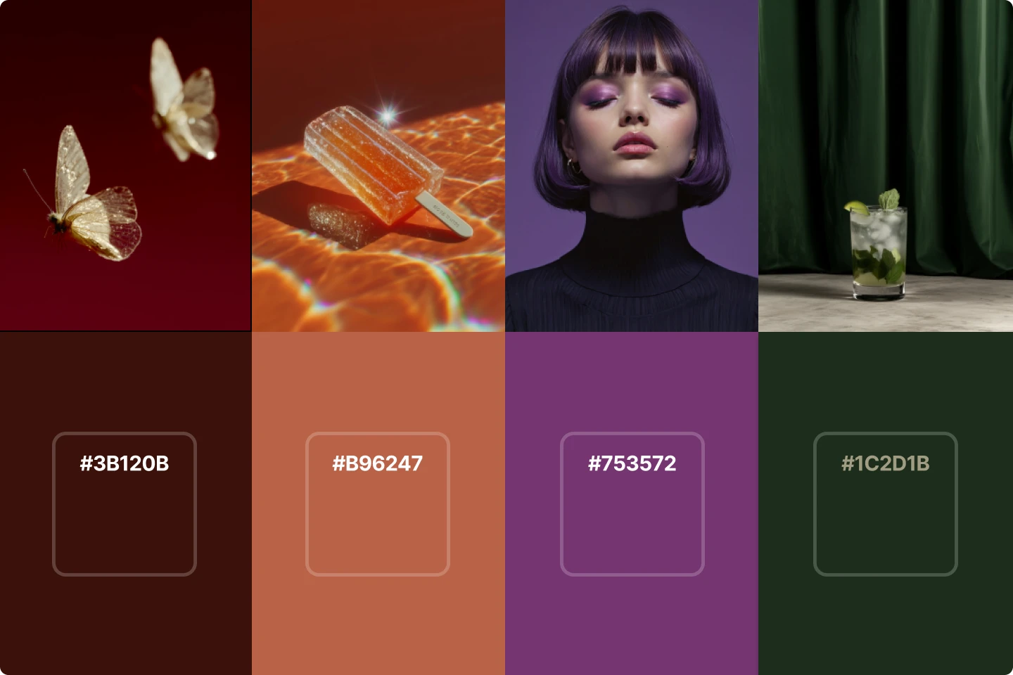
And, if you need free images for your portfolio, make sure to check out Lummi.
What is vibe coding?