Basic design layout tips you might have forgotten


If you’ve been pushing pixels or obsessing over the roundness of corners for a while, you know the importance of designer layout.
But, for those new to the layout game, whether you're designing a website, a magazine spread, or a social media post, the way you arrange elements can make or break your design.
It might sound super obvious (because it is), but good layouts don’t happen by accident—they are the result of you being careful about planning, structure, and an understanding of key principles like grids, typography, color, and composition.
If you’ve ever struggled to make a design look “right” but couldn’t quite figure out why it felt unbalanced or cluttered, this guide is for you.
By breaking down the core elements of graphic design layout, you’ll learn how to organize your work more effectively, create hierarchy, and craft compositions that are both visually engaging and functional.
Why layout matters in graphic design
A graphic design layout isn’t just about making something look nice. It plays a crucial role in how viewers interact with your design. A strong layout guides the eye naturally, ensuring that important information stands out while supporting elements remain in the background. When done well, a layout enhances readability, improves engagement, and strengthens the overall impact of the design.
Bad layout choices, on the other hand, can create confusion. If text is difficult to read, graphic elements feel disconnected, or design elements don’t align properly, the entire message can be lost. Viewers shouldn’t have to work hard to understand what they’re looking at—your design should do that work for them.
With that in mind, let’s dive into the key techniques and basic principles that will help you refine your composition in graphic design and create more effective layouts.
Need a strong foundation? Start with grids
Grids are one of the most powerful tools for structuring a design. They provide a framework that organizes content, ensuring consistency and alignment across different elements. Without a grid, layouts can feel scattered and inconsistent, making it difficult for viewers to follow the intended flow.
A grid divides the canvas into a series of columns and rows, creating an invisible structure that guides placement. This allows designers to align elements in a way that feels balanced and intentional. It also ensures that designs remain consistent across multiple pages or screens, which is especially important in branding and editorial work.
Setting up a grid
To set up a grid, start by defining margins. These create breathing space around the edges of the design, preventing content from feeling too cramped. Next, decide on the number of columns.
A 12-column grid is a popular choice because it offers flexibility—it can be broken into halves, thirds, or quarters, depending on the needs of the design. Finally, set a gutter width, which is the space between columns. This prevents elements from feeling too tightly packed together.
Most design platforms have built-in tools to help make grids easily. Plus, there are also online resources that allow you to generate grid templates, which can be imported into your design software as a guide. Once your grid is set up, arranging content becomes much easier, as everything falls into place naturally.
Typography layout for better readability
If you’ve been in the design world for a while, you know that many people will say that typography and fonts are one of the most important aspects of graphic design layout. A well-structured typography layout ensures that text is easy to read and guides the viewer through the content in a logical order. Without proper hierarchy, a design can feel overwhelming, leaving your audience unsure of where to focus.
How to establish hierarchy with typography
Hierarchy is established through size, weight, and spacing. Headlines should stand out by being significantly larger than body text. A common guideline is to either double or triple the point size of the body copy when setting the heading. For example, if body text is set at 15 points, the heading should be at least 30 or 45 points to create clear differentiation.
Font weight also plays a role in establishing hierarchy. Instead of making subtle changes between weights, aim for strong contrasts. Jump from light to bold or regular to extra bold rather than making incremental adjustments. This ensures that headings and subheadings stand out clearly without blending into the body text.
Don’t forget about spacing your fonts!
Spacing is another crucial factor. Increasing line height (leading) makes body text easier to read, while adjusting letter spacing (tracking) can help create distinct visual styles. For example, wider letter spacing works well for uppercase titles, giving them an airy, elegant feel, while tighter spacing creates a more compact and bold appearance.
Choosing the right typeface also impacts readability and tone. Sans-serif fonts like Helvetica or Futura work well for modern, minimalist layouts, while serifs like Garamond or Times New Roman create a more classic, traditional feel. The key is to ensure that the typography aligns with the overall style of the design while maintaining clarity.
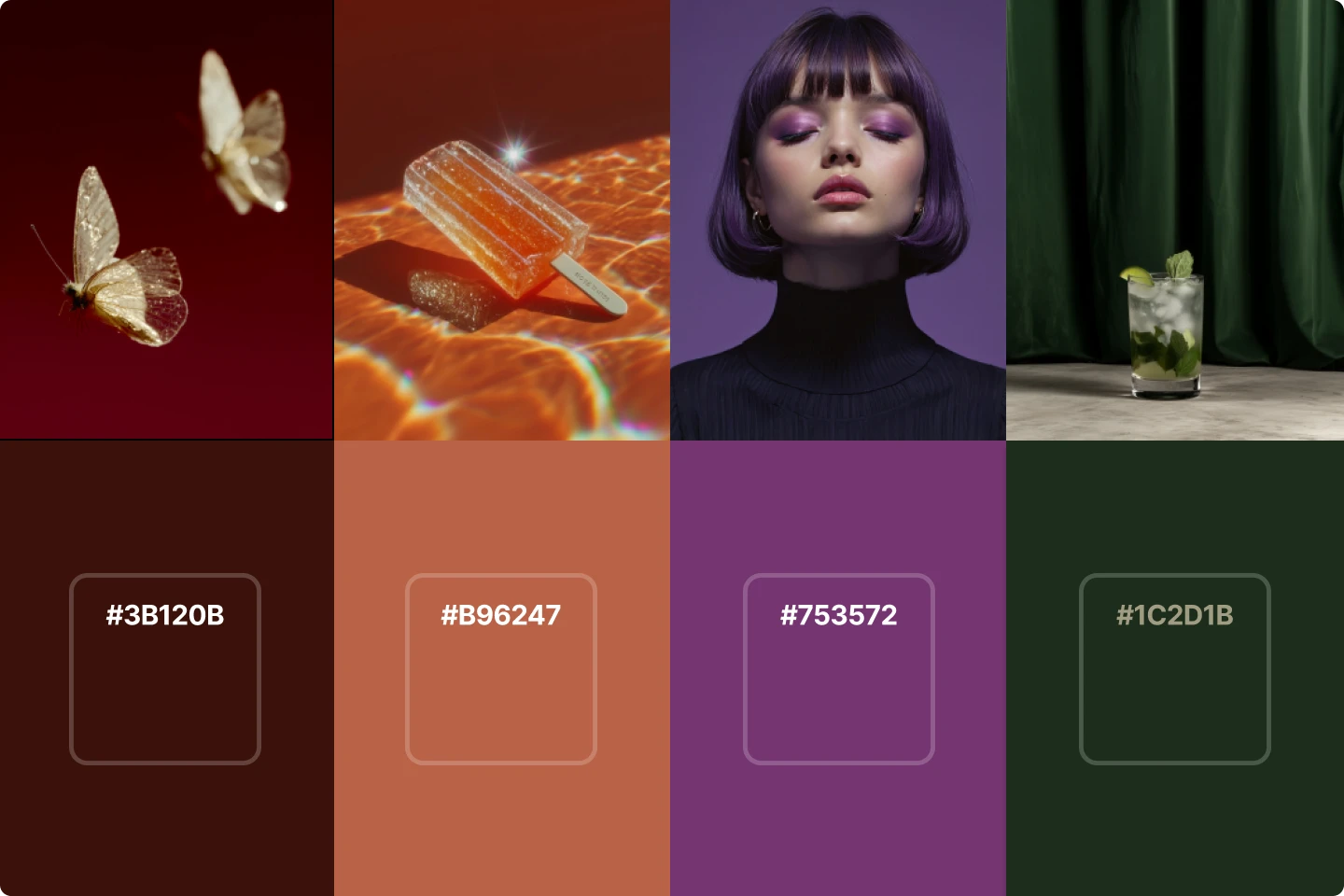
Are colors crucial for layout? Absolutely
Color plays a major role in setting the mood of a design. The right palette can create contrast, highlight key elements, and reinforce brand identity. A well-thought-out color scheme makes a design feel polished and intentional, while poor color choices can lead to visual confusion.
Choosing the right colors
A great place to start when developing a color palette is the color wheel. Analogous colors, which sit next to each other on the wheel, create a harmonious and smooth look. Complementary colors, found opposite each other, provide strong contrast that makes key elements stand out. Triadic color schemes, which use three evenly spaced colors, create a vibrant and dynamic feel.
When applying color to a design layout, it’s important to use it strategically. Not every element needs to be colorful—too many competing colors can make a layout feel chaotic. Instead, use color to draw attention to the most important information, such as headlines, call-to-action buttons, or key visual elements.
Accessibility is also an important consideration. Some viewers may have difficulty distinguishing between certain colors, so it’s important to ensure that there is enough contrast between text and background. Online tools like WebAIM’s contrast checker can help confirm whether your color choices meet accessibility standards.
Creating depth with layers
Layering adds depth and complexity to a graphic design layout, making it more visually engaging. Instead of placing elements flatly on the canvas, layering allows you to create relationships between different parts of the composition.
One effective technique is overlapping elements to create interaction between text and images. For example, placing a title partially over an image can integrate the two elements more seamlessly. Another approach is using transparency and blending modes to add subtle depth, such as a semi-transparent text box over an image background.
Hierarchy also applies to layering. Foreground elements should be the most eye-catching, while background elements provide support without dominating the design. Using drop shadows, gradients, and opacity adjustments can further enhance this effect.
Compositions are a blend of balance and chaos
All professional designers will agree that a well-balanced layout feels stable and cohesive, while an unbalanced design can feel chaotic which can either make it more magnetic or feel unfinished (it's a delicate dynamic). These are basics that have a huge impact on whether viewers will stay engaged with your designs.
One of the nice things about this is that there are different ways to approach balance. Symmetrical balance places elements evenly on both sides of the design, creating a formal and organized look. Asymmetrical balance, on the other hand, creates a more dynamic and modern feel by distributing elements unevenly while maintaining visual harmony.
Spacing also plays a critical role. Negative space, also known as white space, is just as important as the content itself. It allows elements to breathe, improving readability and preventing the design from feeling cluttered. A well-placed use of white space can draw attention to key elements by eliminating distractions.
Experimenting with new layouts
One of the best ways to improve as a designer is to constantly experiment with new design layouts. It’s easy to fall into a routine of using the same structure repeatedly, but trying different approaches helps push creative boundaries.
How to get some inspiration for experimenting
A great way to generate new ideas is by looking at references. Collect inspiration from magazines, websites, packaging, and posters to see how other designers arrange content. Analyzing layouts can reveal new techniques and trends that can be incorporated into your own work.
Sketching out ideas before moving to digital layout and content creation tools can also be beneficial. Thumbnail sketches allow you to quickly explore multiple layout options without getting stuck in details. Once you have a few promising concepts, you can refine them digitally and test different variations.
Little things can have a big impact on your design layout
Mastering graphic design layout requires a combination of structure, hierarchy, and creativity. Using grids ensures alignment and consistency, while typography choices define readability and tone. Color adds emphasis, layering creates depth, and balance keeps everything visually harmonious.
By applying these principles and practices, continuously experimenting, and studying about the future of design, you’ll develop layouts that not only look great but also communicate effectively. Whether you’re designing for print, web, or branding, understanding these foundations will set your work apart and elevate your skills as a designer.
8 design books that every creative person should read