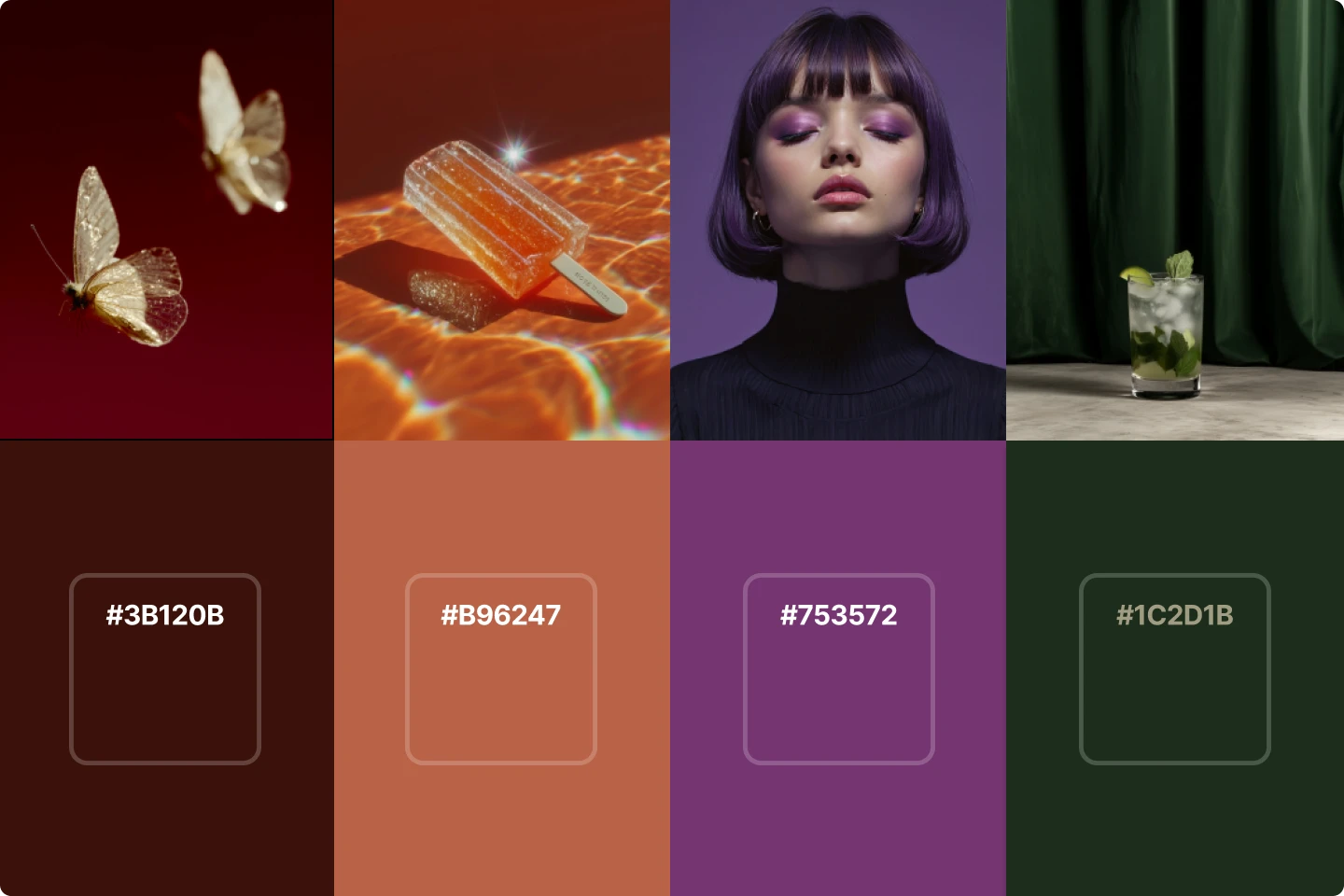
The 6 key UX principles of clean design


Design trends come and go, but clean design principles are always essential for designers to understand.
Why? Because clean design removes distractions, improves usability, and makes content easier to digest. Whether you're building a landing page, an app, or deck, these principles will help you do it better.
But before jumping into the techniques, let’s look at a few more reasons why clean design matters for beginners.
Why clean design is important
Design without clarity is noise. Users shouldn't have to guess what something means or how it works. Clean design keeps things obvious. It puts the focus on what matters and removes the rest.
When people land on a site or open a presentation, they decide in seconds if it’s worth their time. If things feel cluttered or confusing, they’ll leave. A clean layout signals that someone thought this through. It builds confidence and makes people want to keep going and dive even deeper into the user experience.
In a busy digital world, clean design gives your work the edge. It gets your message across faster and with less effort.
Jumping into the rules of clean design
One thing that’s genuinely awesome about these principles is that you don’t need fancy AI tools or years of experience to apply them. Just focus on the basics. Clean design is about structure, simplicity, and consistency. These six rules will help you build that foundation.
1. Make sure you understand white space
White space isn’t empty. It guides attention, separates sections, and makes everything easier to scan. Without it, designs feel packed and overwhelming.
Use margins, padding, and spacing to break up your layout. Let elements breathe. When in doubt, remove something and step back. If it feels more balanced, you’re doing it right.
Don’t be afraid of space. It’s what makes the content feel intentional and readable.
2. Two fonts maximum if you're using fonts
Too many fonts confuse users. Stick to two: one for headings, one for body text. That’s enough to build contrast and hierarchy without creating chaos.
Pick fonts that work well together. A bold sans-serif for headers and a clean serif for paragraphs is a classic combo. Keep font sizes and styles consistent throughout the design.
Good typography doesn’t shout. It supports the message and disappears into the background.
3. Less colors (usually) means a cleaner design
A limited color palette brings focus. Choose one or two main colors, a few neutrals, and maybe one accent. That’s usually all you need.
Too many colors compete for attention. They blur the hierarchy and make layouts feel busy. When you use fewer, each color carries more weight.
Start with grayscale if you’re unsure. Add color only where it supports function, like buttons or alerts. Let simplicity drive your palette.
4. Content minimalism is key
Say only what needs to be said. Long paragraphs, repeated points, random elements, or extra filler all get in the way. Aim for short sentences, clear headings, quality images, and visual breaks.
Most people scan instead of reading word for word. Help them find what matters fast. Use bullet points. Trim blocks of text. Delete anything that doesn’t support the main point when it comes to text or visual elements.
Minimal content doesn’t feel empty. It feels focused and respectful of the viewer’s time. Plus, now with all the AI content tools that exist, having the right assets is easier than ever.
5. Make sure you are aligning your elements
Nothing throws off a design faster than sloppy alignment. Even a small misplacement can make things feel unprofessional.
Use consistent spacing. Line up your headers, text blocks, and buttons. Stick to a grid if you have one. If something looks off, fix it—even if no one else notices.
Alignment brings order. It makes things easier to follow and signals that you care about the details.
6. Keep any animations consistent
Motion and motion graphics can help guide attention or smooth transitions. But it needs to feel purposeful. One button sliding in while another fades out will confuse users more than it helps.
Use the same type of animation across similar elements and focus on matching timing and easing. Avoid flashy effects unless they have a clear function.
When animation supports the flow of the interface, it adds polish. When it pulls focus for no reason, it just gets in the way.
Start creating clean designs for your portfolio
Good design solves problems. Clean design solves them faster. It shows respect for the user, makes things easier to use, and lets content stand out.
These six rules are starting points. They help create structure so your work can grow from a strong foundation. As your skills develop, you’ll find ways to adapt them to different projects. But the core idea stays the same.
Don’t add more. Remove what doesn’t help.
Let your work speak clearly.
Need more inspiration for your designs? Read the best design blogs in 2025 and beyond.
Get inspired by these design quotes