LinkedIn banner ideas and tips that will get your profile noticed

.webp)
Whether you're a seasoned professional or new to the workforce, these LinkedIn banner tips will help your profile get noticed.
Ever scroll through LinkedIn and notice some profiles just stand out? Their banners catch your eye and make you want to learn more about them. That's no accident. A great LinkedIn banner can make a huge difference in how people perceive you.
Today, we’re diving into LinkedIn banner ideas that will get your profile noticed.
But first, LinkedIn stats you should know
Understanding the impact of LinkedIn can help you appreciate why having a standout profile is so important. Check out these eye-opening stats:
- LinkedIn has helped 4 million people get jobs through the "Jobs for You" feature.
- There are over 14 million open jobs on LinkedIn.
- 97% of HR and staffing professionals use LinkedIn in their recruiting efforts.
- Candidates with a comprehensive LinkedIn profile have a 71% higher chance of getting a job interview.
These stats show just how crucial LinkedIn can be for growth and improving your career.
1. Nail the perfect LinkedIn banner size
The best place to start is with the basics and the size of your LinkedIn banner.
The optimal dimensions
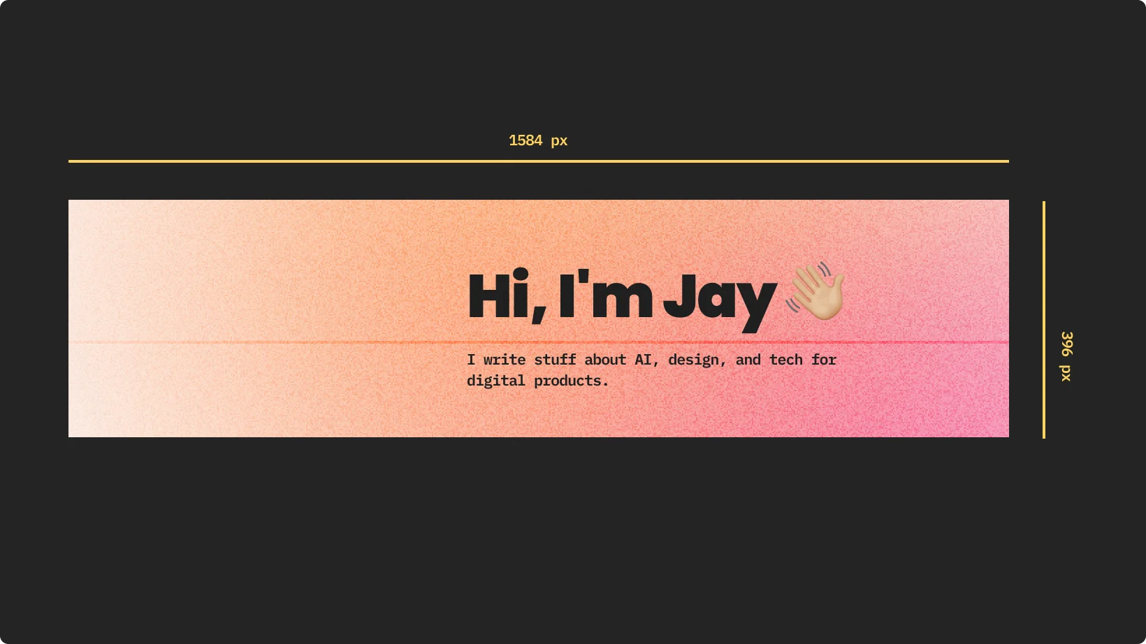
To make your banner look sharp and professional for your LinkedIn page, use the optimal dimensions: 1584 x 396 pixels. This recommended size ensures your banner doesn’t get blurry or pixelated.
- Too small: Stretches and loses quality.
- Too big: Crops out important parts.
Stick to 1584 x 396 pixels, and you’ll be golden.
Why it matters
Getting the size right is crucial. A clear, sharp banner gives a great first impression. It's like the digital equivalent of a firm handshake.
When your LinkedIn cover photo is the right size and high resolution, it shows you care about the little things. And trust me, people notice.
2. LinkedIn banner ideas to elevate your profile
Your banner should reflect who you are and what you do, but should also be visually appealing to give your page a little pop.
Showcase your personal brand
If you have a personal brand, your LinkedIn background image is a great place to showcase it. Here are some tips you can combine with stock images to make your banner shine.
- Logo: Feel free to position it prominently. You can even include your company logos if you want!
- Tagline: Keep it short and impactful.
- Colors: Use your brand’s colors for consistency.
Think of your banner as the first catchy visual that can drive viewers to a call to action you want them to take.
.webp)
Tailor it to your industry
Different fields call for different styles. Tailor your banner to match your industry.
- Professional: Sleek, clean lines and professional imagery.
- Creative: Bold colors and unique visuals.
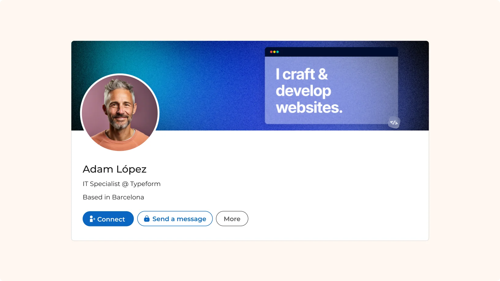
Think about what makes you unique and let your banner tell that story. An eye-catching design can make all the difference.
Seasonal themes
Keep things fresh with seasonal themes. Update your banner for holidays, seasons, or special events. This keeps your profile current and engaging.
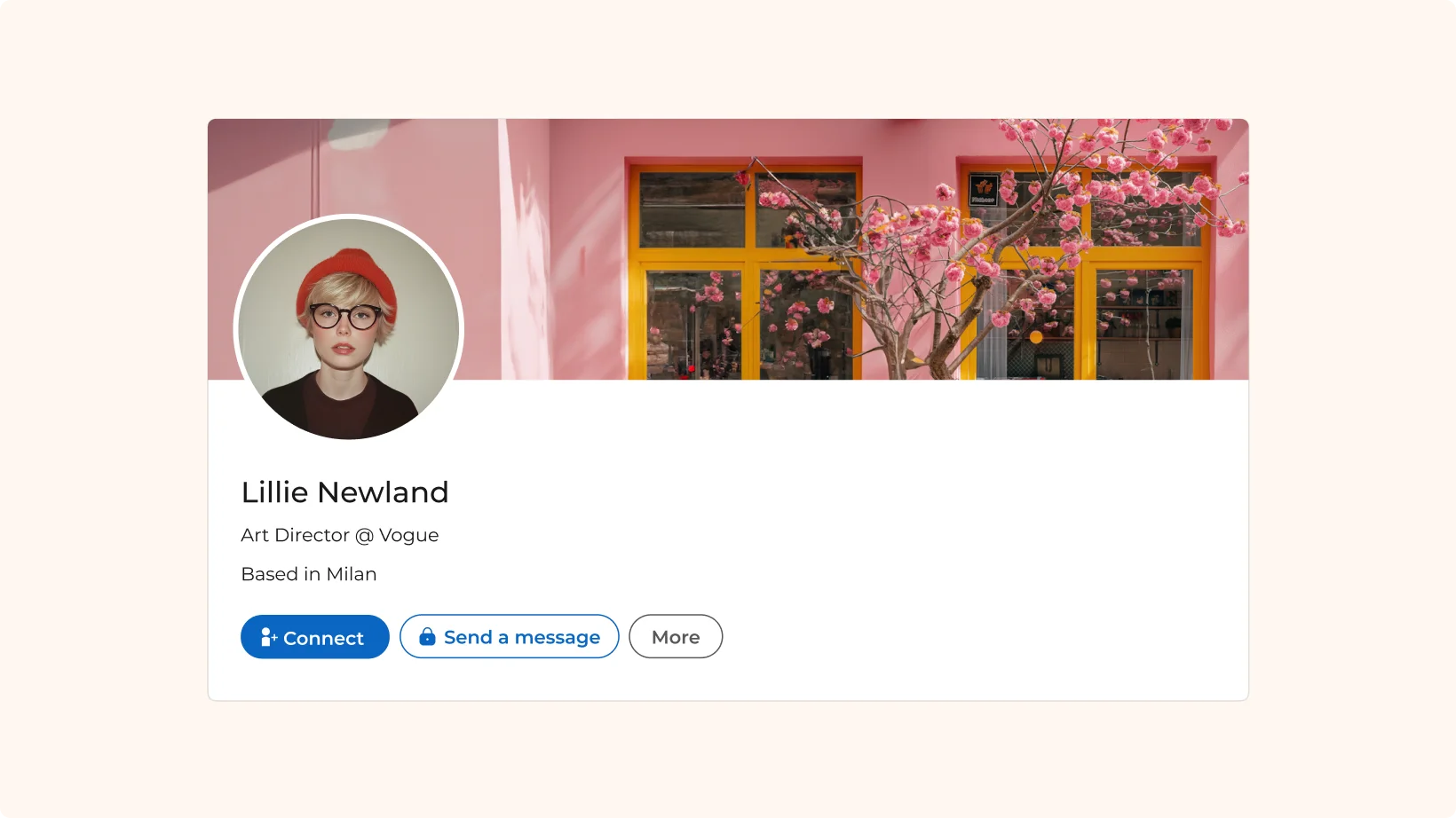
- Holidays: Add festive touches.
- Seasonal: Reflect the time of year.
- Events: Promote upcoming events or milestones.
Changing your banner seasonally shows that you’re active and engaged.
3. Unlock creativity with Lummi stock photos
Stock photos are a great resource, especially when they’re high quality and royalty-free. Lummi is a fantastic option here.
Why Lummi
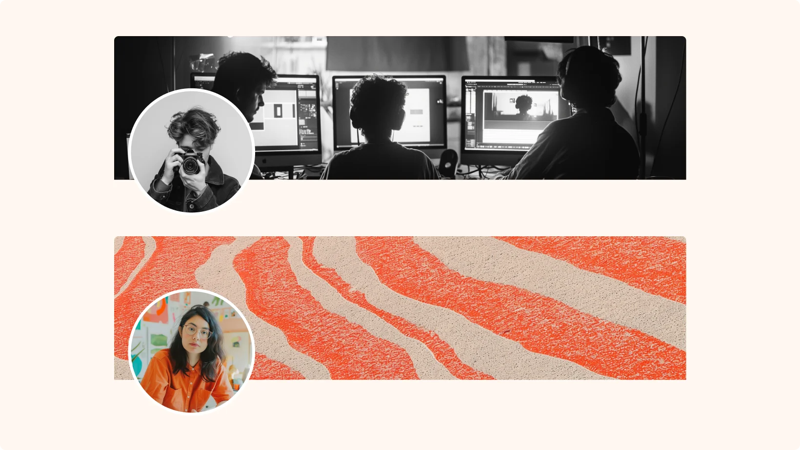
Whether you're looking for an image with a Y2K aesthetic or just a simple composition, Lummi has hundreds of thousands of royalty-free AI stock images. These free stock images are free for both personal and commercial use. What's even better? You can now choose curated banners for your personal and business pages directly in LinkedIn!
Choosing the right image
When picking images, make sure they align with your brand. Consistency is key. Match your banner with your profile photo and overall aesthetic.
Spend some time browsing Lummi’s collection of high quality images. Find images that speak to you and your brand.
Some tips to customize your image
Use Lummi’s features to customize your stock photos like applying a duotone filter, or tweaking adjustments. If you use other editing apps like Canva, you can also add text on top of your Lummi images by using the plugin. These details help your banner stand out even more.
Best practices for designing LinkedIn banners
When considering the design of your banner, here are some best practices to keep in mind.
1. Simplicity rules
Simplicity is powerful. Don’t overcrowd your banner with too much noise. A clean, simple design often works best.
2. Ensure readability
If you have text, ensure your it is readable. It should stand out against the background. Use contrasting colors and clear fonts.
- High contrast: Make text stand out.
- Clear fonts: Use easy-to-read fonts.
3. Optimize for mobile
Remember, people view LinkedIn on their phones too. Make sure your banner looks great on both desktop and mobile. Test it on different devices to be sure.
- Responsive design: Check how it looks on mobile.
- Test across devices: Ensure consistency.
Tools to create stunning LinkedIn banners
You don’t need to be a design wizard to create a stunning LinkedIn banner. Here are some tools that can help.
.webp)
Canva
Canva is a user-friendly tool for creating professional banners. It offers a wide range of templates and easy drag-and-drop features.
- Templates: There are more than 50 LikedIn banner templates to get you started.
- Free LinkedIn Banner Maker: Make your profile pop up using this banner generator.
- Customize it: Add your own photos, icons, and text to personalize your design. You can match the banner to your LinkedIn profile photo and overall brand aesthetic.
- Collaboration: Share your design with team members for feedback and edits in real time.
Figma
Figma is a powerful design tool that’s great for more advanced users. It’s perfect if you’re looking for more control over your design elements.
- Community files: Get free templates from the community to preview your LinkedIn banner.
- Plugins: Enhance your design process with various plugins. From icons to stock photos, Figma’s plugins can streamline your workflow.
Lummi
Lummi makes it easy to use stock photos directly in your LinkedIn banners. This can save you a lot of time and effort.
- Stock photos: Hundreds of thousands of high-quality images to choose from. These images are royalty-free and perfect for both personal and commercial use.
- Easy integration: Import images seamlessly into your design tools like Canva, Figma, or Adobe. This flexibility ensures you can use Lummi photos no matter what tool you prefer.
- Curated banners: Choose from a selection of curated banners directly in LinkedIn.
Adobe
Adobe offers a suite of tools that can help you create stunning LinkedIn banners. From Photoshop to Illustrator and Adobe Express has you covered. To get started, you can try this template.
Real-life LinkedIn banner examples that inspire
Seeing is believing. Here are a few real-life examples of well-designed LinkedIn banners.
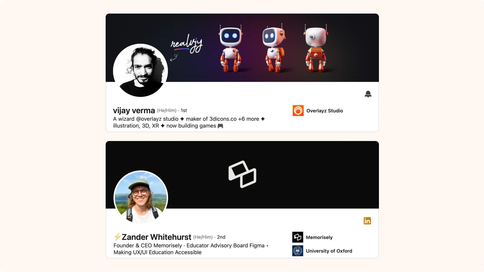
Showcase diverse styles
Display a variety of styles, from professional to creative. Highlight what makes each example effective.
- Professional: Clean and polished. Uses high-quality images and minimal text.
- Creative: Bold and unique. Features bright colors and playful elements.
Analyze what works
Analyze each example. Explain why it works and how it can inspire your own design.
- Effective elements: Break down key features such as color schemes, use of space, and typography.
- Inspiration tips: How to apply these ideas to your own LinkedIn banner.
How to change your LinkedIn banner like a pro
Changing your LinkedIn banner is super easy. Here’s a quick guide to get you started.
Step-by-step guide
- Go to your profile: Head to your LinkedIn profile page.
- Click the camera icon: It's at the top of your profile.
- Select “Upload photo”: Choose an image from your device.
- Adjust positioning: Make sure it looks just right.
- Click “Apply”: Voilà! You’ve got a new banner.
Common pitfalls
Avoid these common mistakes to ensure a smooth update:
- Unsupported file formats: Stick to JPEG or PNG.
- Incorrect image size: Double-check the dimensions.
- Make it consistent: Make sure your image looks good on desktop, on mobile devices, and even on the tablet.
Remember, the maximum file size allowed is 8MB. If you encounter any issues, double-check the file size and format. This simple step can save you a lot of headaches.
Time to make your LinkedIn banner shine
Whether you’re an entrepreneur, just starting in the workforce, or an executive, great LinkedIn banner can set you apart and make a lasting impression. So, start using these tips and tools to create a standout profile!
Ready to get noticed with a stunning banner? Head to Lummi to find a stunning visual today.
All creatives should know about the ethics of AI-generated images
