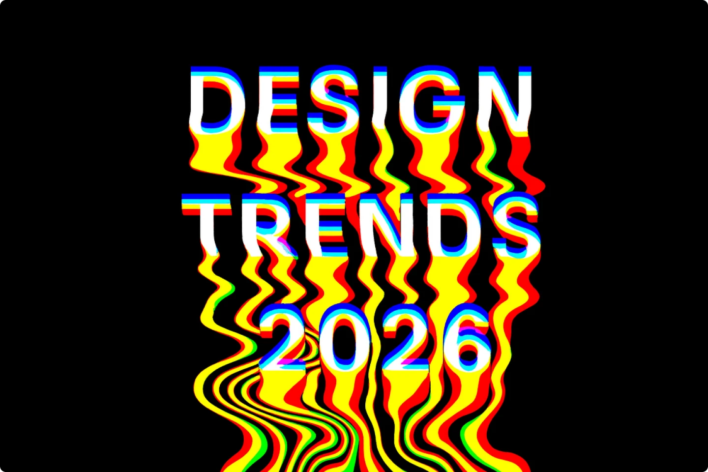
A designer's guide to 2026 color trends for winter

For creatives thinking about 2026, color trends for 2026 emphasize warmth, nature-inspired hues, and a balance between timeless and bold shades. Key themes include rich burgundy and deep purples, cozy and classic neutrals such as creamy white and Universal Khaki, and vibrant yet grounded accent colors like teal and certain greens.
As the new year approaches and 2026 graphic design trends begin to take shape, the creative world is embracing a new blend of exciting colors. That means you should expect winter 2026 color trends to be a mix of grounded, human hues and modern, forward-looking tones that balance nostalgia with transformation.
Many designers and brands are stepping away from hyper-saturated, artificial palettes. Instead, they’re embracing colors that feel natural, textural, and emotionally connected. These tones remind us of comfort, craftsmanship, and calm innovation.
We put this guide together to break down the most influential color trends for 2026. We selected this list from a mixture of industry experts, visual data, and the latest market insights. Here’s where the world of creative color is headed.
TL;DR list of color trends
Here’s a quick look at what’s trending in winter 2026 color palettes:
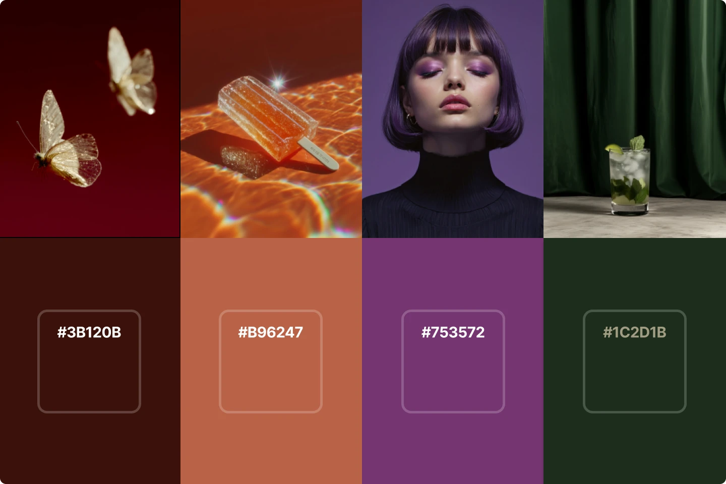
- Rich burgundy and terracotta
- Smokey, transformative teal
- Luxurious earth tones
- Deep purples and warm violets
- Khaki and earthy neutrals
- Jelly mint
- Holographic bloom (pastel lilac, blush orchid, and frosted coral)
- Mustard and butter yellow
- Blue aura
- Textural greens and softened greys
Top color trends for 2026 winter
The color trends we’ve chosen capture the essence of the upcoming season. Each shade connects to how people want to feel in 2026. While the color of the year set the tone for creativity in color, these palettes expand on it with fresh contrasts and modern takes on neutral colors.
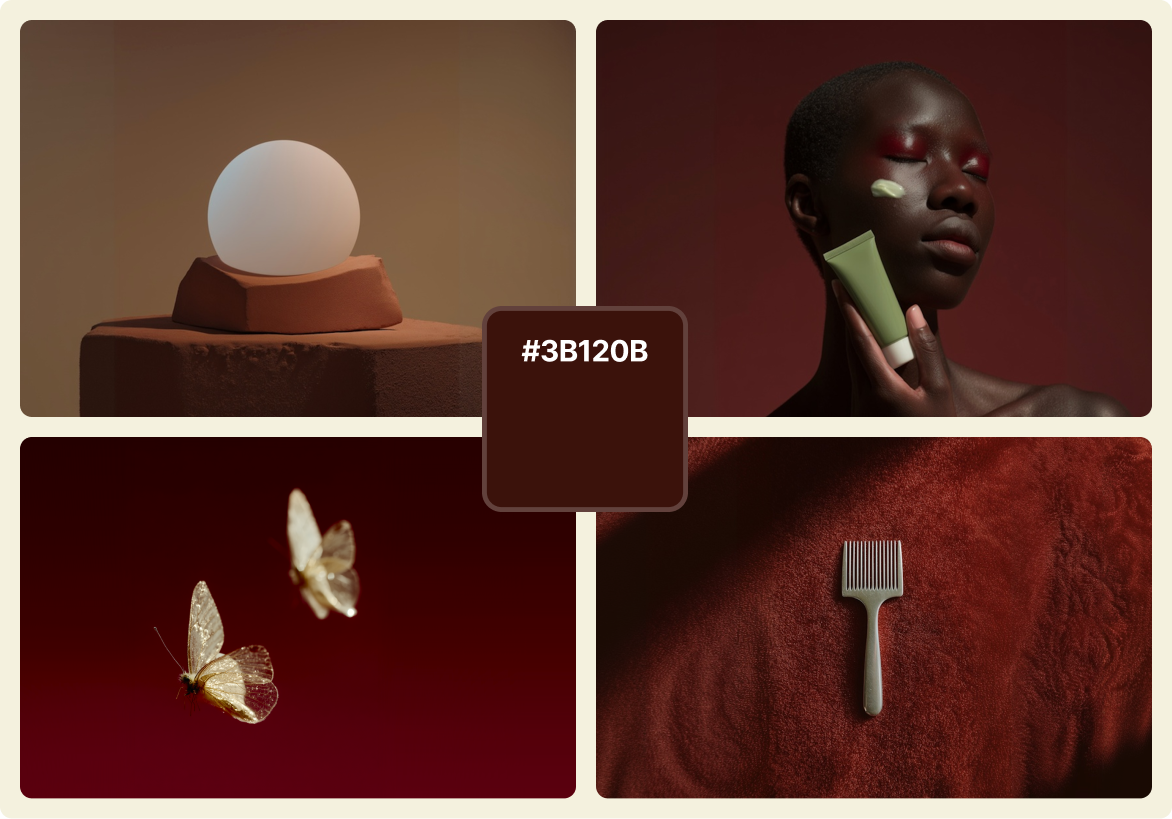
1. Rich terracotta
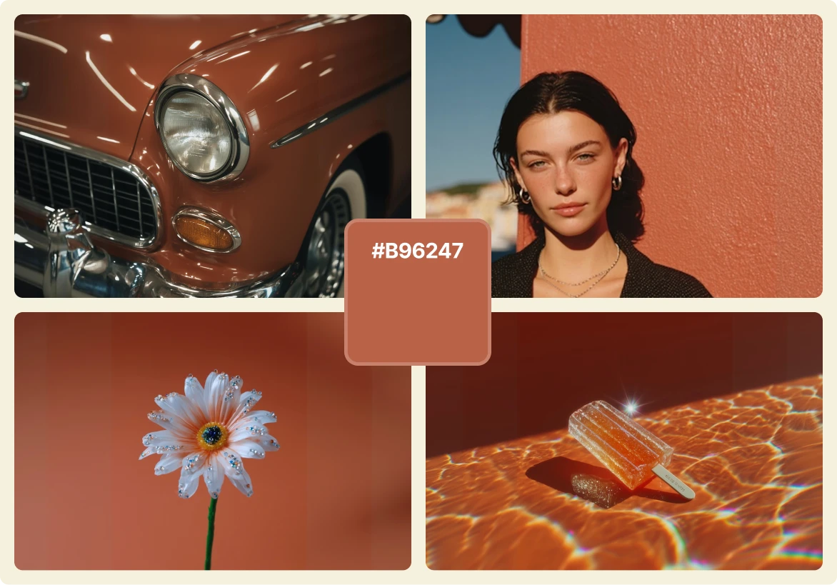
Leading the 2026 color trends are deep, inviting shades of burgundy and terracotta. Burgundy brings an elegant richness, while terracotta grounds the palette with an organic, sun-baked warmth.
Together, they create a sense of stability and sophistication. You’ll find these tones in product packaging, interior design, and digital branding that seeks to feel luxurious without being excessive.
Burgundy signals confidence and tradition, while terracotta adds approachability and earthiness. They complement natural materials like leather, clay, and wool, making them ideal for the colder season.
2. Smokey, transformative teal
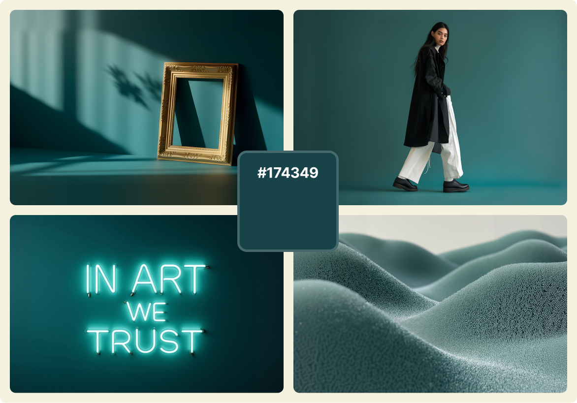
Teal continues its evolution in 2026, trading brightness for a smokier and more transformative tone. This variation of teal feels calm, complex, and deeply versatile.
This futuristic teal is a color that can shift easily between digital and physical spaces. Designers use it as a bridge between nostalgic and retro-futuristic aesthetics. It pairs effortlessly with warm neutrals, beige tones, and subtle copper highlights.
Smokey teal is especially popular in high fashion, lifestyle design, and editorial layouts that want a touch of depth without losing softness.
3. Luxurious earth tones
One of the most defining color trends 2026 brings is the rise of luxurious earth tones. These hues—caramel, umber, sienna, and clay—represent warmth, authenticity, and balance. Imagine matcha being made in a luxurious sidewalk cafe in Mexico city.
As sustainability continues to influence aesthetics, these natural shades echo a desire for connection and intention. Designers are using them in layered gradients, organic compositions, and tactile product visuals.
Earth tones when paired with creamy accents or soft whites, add depth and sophistication. This palette works across industries, from fashion to digital branding, offering a timeless visual anchor.
4. Deep purples and warm violets
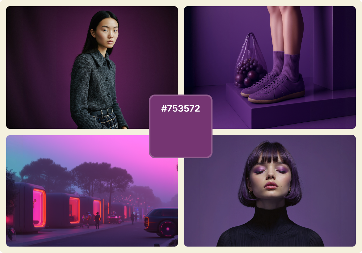
Purple continues to reinvent itself. For 2026, the focus shifts to deep purples and warm violets that combine elegance with emotion.
These tones fall somewhere between boldness and serenity. They’re rich, nuanced, and often paired with browns or muted metallics for a contemporary look. Designers use them to create luxury, creativity, and individuality within visual systems.
Paired with cream or navy, these shades convey balance and depth. They also bring warmth to colder compositions, making them a perfect fit for the winter 2026 color trends.
5. Khaki and earthy mid-tones
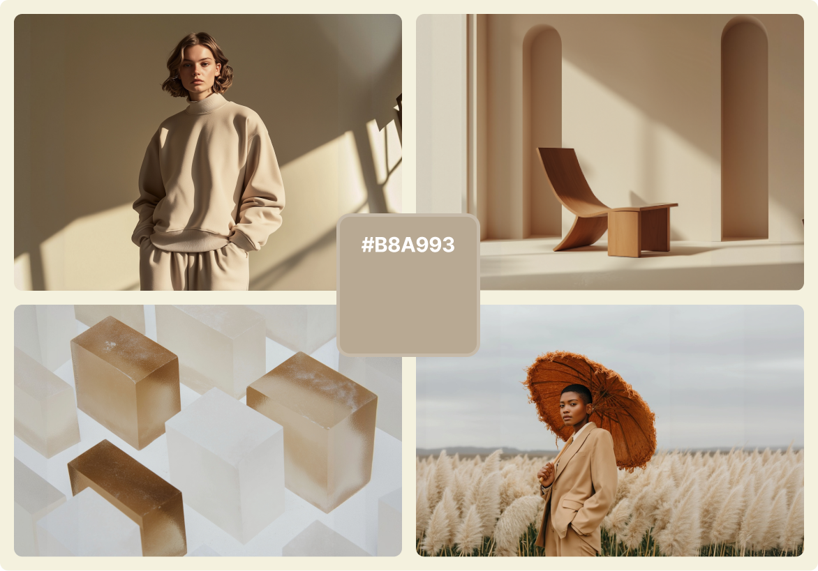
Khaki is returning with subtle strength. After years dominated by bright, high-contrast palettes, 2026 marks a shift toward calm, thoughtful neutrals. Sherwin-Williams and HGTV Home are a major indication of the power of this color trend, as universal khaki is taking center stage on their color trends report.
These shades—mushroom, sand, taupe, and oat—create a sophisticated sense of quiet. Designers are no longer treating them as background fillers. Instead, they’ve become central tones for minimalist and wellness-focused design.
Khaki works beautifully with almost any accent color. Pair it with burgundy for depth, lilac for softness, or navy for a timeless finish. Its flexibility makes it a favorite among interior and product designers aiming for visual harmony.
6. Jelly mint

Jelly mint stands out as the playful, optimistic choice. This clean, translucent green brings a refreshing quality to an otherwise earthy season.
It feels crisp and lively, which makes it perfect for digital interfaces, motion design, or branding that aims for innovation and freshness.
Jelly mint shines when used as a secondary or accent color. It pairs well with blush tones, pale greys, or soft beige, giving just enough contrast to keep designs light and modern.
7. Holographic bloom
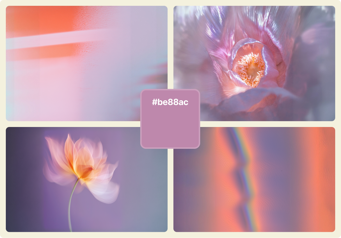
For designers drawn to more ethereal aesthetics, holographic bloom is one of the most striking color trends for 2026. Imagine a delicate trio of pastel lilac, blush orchid, and frosted coral.
This palette creates a glowing, iridescent effect that feels futuristic but still gentle. It works especially well in gradients, typography, and 3D visuals where light plays an essential role.
Holographic bloom bridges beauty and technology. It’s appearing in fashion, beauty campaigns, and digital art projects that want a fresh yet emotional appeal.
8. Mustard and butter yellow

Few colors can brighten winter like mustard and butter yellow. These shades bring a touch of sunlight into an otherwise muted season.
Mustard adds richness and retro charm, while butter yellow brings warmth and softness. Together, they represent optimism and comfort.
In design, these colors are being used to refresh classic visuals. They pair beautifully with browns, lilacs, and muted greens, offering balance without excess brightness.
Unlike past years, yellow in 2026 feels mature and grounded, making it a perfect match for designers who want subtle optimism.
9. Blue aura
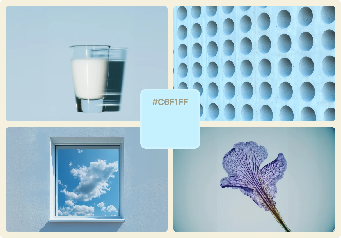
Blue aura is a soft, calming shade that embodies clarity and focus. It’s one of the standout tones defining color trends 2026.
This version of blue has a slightly translucent quality, almost like a veil of light. It symbolizes calmness and reflection, which makes it ideal for digital spaces, wellness brands, and product packaging.
When paired with silver, white, or soft neutrals, blue aura adds serenity to any layout. It’s a color that feels forward-looking while remaining universally appealing.
10. Textural greens and softened grays

Rounding out the winter 2026 color trends are textural greens and softened greys. These hues emphasize touch, texture, and calm restraint.
The greens lean toward moss, sage, and eucalyptus, while the greys feel soft and slightly warm. Together, they capture a sense of balance between natural and industrial design.
Designers use these tones to express stability and timelessness. They’re ideal for architecture, product design, or digital environments that prioritize harmony over intensity.
This combination reflects a broader trend in 2026: design that values calm confidence instead of loud statements.
Start creating with the colors of 2026
The 2026 color trends show that design and UI trends are entering a more reflective phase; a phase where humans are confronted with a modern design world where technology is on the rise. Instead of focusing on shock value, designers are choosing palettes that communicate calm, texture, and authenticity.
If you’re a designer, illustrator, or brand strategist, now’s the time to start experimenting. These colors can help shape visuals that feel both of the moment and timeless.
Let these palettes inspire your next project, and discover how the colors of 2026 can help you create work that feels real, resonant, and ready for the future.
Want to stay ahead of the creative curve? These are the most important design skills you'll need in 2026.
2026 graphic design trends