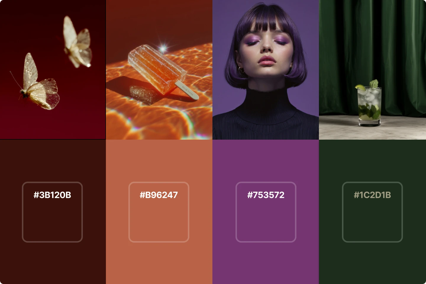
2025 color trends all creatives need to know


2025 is right around the corner, so we decided to look at the colors that will shape our design in the coming year. Here's what we found.
Color trends in 2025 will play a vital role in shaping the creative landscape, influencing everything from web design and branding to presentations and fashion.
That's why staying on top of emerging trends is so important to keep your work fresh and relevant. For creatives, understanding how to use the latest colors strategically can make all the difference in capturing an audience’s attention or setting a product apart from the competition.
As we head into 2025, color choices are moving towards rich, inviting tones that evoke warmth, tranquility, and depth.
These trends are not just about following what’s popular but also about understanding how colors can communicate moods, influence emotions, and complement broader design elements.
Why color trends should matter to you
Designers of all different fields consistently use color to guide emotions and create experiences. By integrating these trending colors into your designs, you can ensure that your work resonates with current audiences and trends.
In 2025, rich hues will play a big roll in creativity, giving designers like you the tools to convey sophistication, warmth, and vibrancy.
As we explore the specific shades of 2025 color trends, think about how you can use these tones to elevate your creative work and keep it relevant in a world where design trends move quickly.
Special mention to Pantone’s 2025 Color of the Year: Mocha Mousse
Pantone’s PANTONE 17-1230 Mocha Mousse has been named the 2025 color of the year, celebrated for its rich, warming qualities. This deep brown hue combines the indulgence of chocolate and coffee with a sense of comfort and stability, perfectly aligning with our collective desire for reassurance and grounding.
Mocha Mousse shines in interior design, where it brings warmth and sophistication to spaces, especially when paired with neutral colors or muted tones. Its versatility makes it equally powerful in branding, lending an earthy, luxurious feel to logos and packaging. Whether as a dominant shade or a subtle accent, Mocha Mousse embodies the richness and adaptability that define 2025 color trends, making it a must-have for any creative palette.
1. Ethereal blues
First on the list of 2025 color trends is ethereal blues. Soft, calming, and a bit otherworldly, these hues bring a serene energy to any project. Ethereal blues are excellent for industries like wellness, health, and technology, where calmness and trust are key emotional drivers. This color has a dual personality—it feels modern and timeless, making it versatile for web design, branding, or even interior design.

If you’re working on a project that needs a peaceful vibe—like a meditation app or spa branding—ethereal blues will work wonders. Think of it as a softer alternative to stark whites or greys, offering a touch of warmth without overwhelming the audience.
2. Warm yellows
These are the shades that will inject energy and optimism into any design. Warm yellows with yellow undertones provide a feeling of friendliness and approachability, which is why they’re a favorite for creative brands, educational products, and anything aiming to foster a sense of community. The brightness of these tones draws attention without being harsh, making it perfect for call-to-action buttons, promotional materials, or retail packaging.

When using warm yellows, balance is key. Too much yellow can overwhelm a design, but paired with neutrals or muted colors, it can add the right touch of warmth. Whether you’re branding a new product or refreshing a website, this color offers the perfect way to radiate positive energy.
3. Creamy pastels
Creamy pastels continue to be a strong trend in 2025. These colors exude softness and subtlety, making them perfect for UI designers, social media managers, and marketers. Unlike brighter pastels, creamy pastels bring warmth to your palette, giving a nod to nostalgia without feeling outdated.

These soft, muted tones are ideal for creating clean, calming visuals that don’t demand attention but gently hold it. They work well as background colors or even product packaging. Pairing creamy pastels with neutral colors like beige or grey can enhance the tranquility they bring to a design.
4. Burnt oranges
Burnt oranges are emerging as one of the boldest colors of the year. Rich, earthy, and warm, burnt orange is perfect for designs that need to make a statement without being loud. These tones are excellent for industries that want to evoke creativity, energy, and confidence—like fashion, home decor, and lifestyle brands.

Burnt oranges bring a rustic, yet modern feel, making them particularly popular in interior design and branding on social media. The warmth of burnt orange plays beautifully against neutral colors like beige, taupe, or greys, creating a balanced yet visually striking look.
5. Moonlit greys
Moonlit greys offer a sophisticated, moody option for creatives looking to introduce a touch of mystery to their work. Slightly different than standard greys, this color has depth, offering a grounding effect without feeling dull or lifeless. Moonlit greys are ideal for professional industries—finance, tech, and consulting—where sleek, modern designs are paramount.

Moonlit greys also create an elegant backdrop that allows other colors, particularly rich hues, to shine. When paired with deep brown or dark brown accents, this color can transform a room into a chic, contemporary space. Whether you're designing a website or styling a home office, moonlit grey is a must-have in 2025.
6. Glossy black
Glossy black takes sophistication to the next level. This color stands out for its luxurious, bold, and dramatic appeal. Unlike matte black, glossy black has a reflective finish that adds depth and interest. It’s a top pick for industries like fashion and tech, where a premium feel can be essential.

Incorporate glossy black into logos, presentation designs, or product packaging for a color of the year statement. It also works well in interior design for high-contrast spaces, making it the perfect accent color when used sparingly to avoid overpowering a space.
7. Deeply rich reds
Rich, passionate, and energetic, deeply rich red is a color that demands attention. It’s perfect for designs where a bold, confident statement is necessary. Brands that use deeply rich red in 2025 will convey a sense of urgency, power, and warmth.

This color works best when used in moderation, as too much red can overwhelm. Pair it with neutral colors or muted color palettes to create balance. In interior spaces, deeply rich red works well in small doses—think accent pieces or artwork that adds a pop of color without dominating the room.
8. Wheatfield beige
Wheatfield beige is the refined, grounded shade that offers warmth without veering into the extremes of browns or whites. It’s versatile and fits perfectly into neutral color palettes. This color is particularly well-suited for industries that focus on simplicity and elegance, such as beauty, home decor, and lifestyle.

Whether used for product shots, websites, or branding, this color serves as the perfect backdrop for rich warm tones like deep brown or burnt oranges. Its understated elegance makes it easy to integrate into a wide range of design styles.
Apply these colors to your creative projects
Incorporating these 2025 color trends into your creative projects will help keep your work fresh, relevant, and appealing. For graphic designers, these colors can elevate branding, making it feel modern yet timeless. Interior designers can use these rich, warm, and neutral tones to create spaces that feel both contemporary and inviting.
If you’re looking for free images to go with these color trends, make sure to explore the stock photos, illustrations, and 3D assets on Lummi.
15 Photography Trends for 2025 All Creatives Should Know

